Mastering Visual Hierarchy in Graphic Design for Impact

Learn how visual hierarchy in graphic design guides attention, boosts readability, and creates striking layouts that captivate your audience.
Visual hierarchy is the art of arranging elements to guide a viewer's eye through a design in a specific order of importance. It's how you turn a jumbled mess into a clear, compelling message that people actually understand.
Done right, it grabs attention and keeps it. Done wrong? People just scroll on by.
Why Visual Hierarchy Is Essential for Your Brand
Imagine walking into a library where every book has the same cover, font, and size. You'd never find what you need. It would be pure chaos.
Now, picture a newspaper. Your eyes instantly snap to the massive headline. Then, they drift to the smaller subheadings, and finally, you settle into the article itself. That's visual hierarchy in action. It’s the invisible force that directs attention and creates order where there was none.
For your brand, getting this right isn’t just a "nice-to-have" design skill—it’s a business necessity. The average person spends just 8 seconds scanning a design before they decide to stick around or bounce. That’s it. Eight seconds.
In the fast-scrolling world of Instagram and LinkedIn, where billions of posts are fighting for a sliver of attention, a strong visual hierarchy is what makes your content cut through the noise. If you want to dive deeper into grabbing user attention, check out these design principles from Zeka Graphic.
The Real-World Impact on Your Brand
Without a clear visual path, your message is dead on arrival. A potential customer might miss the key benefit, overlook your call-to-action, or just feel so overwhelmed by your graphic that they keep scrolling. This hits your engagement, your conversions, and how people see your brand.
On the other hand, a well-structured design gets the job done. It:
- Makes things easy to read and understand. Your audience shouldn't have to work to figure out what you're saying. A good hierarchy does the heavy lifting for them.
- Gets people to actually engage. A clear flow of information encourages viewers to interact, whether it's swiping through a carousel or digging into an infographic.
- Builds trust and authority. Professional, organized designs signal credibility. It shows you know what you’re doing and builds confidence in your brand.
- Drives the actions you want. It guides the viewer's eye exactly where you want it to go, like that "Learn More" button or the one big takeaway you need them to remember.
Simply put, visual hierarchy isn't about making your graphics look pretty; it's about making them work. It’s the fundamental skill that turns passive scrollers into engaged followers and, eventually, customers. By showing people what matters most, you make your message impossible to ignore.
The Seven Core Principles of Effective Visual Hierarchy
To grab someone's attention and guide their eyes where you want them to go, you need a solid toolkit of design techniques. These seven core principles of visual hierarchy are what separate a confusing, chaotic graphic from one that speaks with total clarity.
Nailing these principles gives you control over the story your design tells. It ensures your audience sees exactly what you want them to see, in precisely the order you intend. These aren't just abstract theories; they're grounded in how our brains are wired to see the world. For a deeper look at the fundamentals, it's worth exploring other related design principles that form the foundation of great visual communication.
1. Size and Scale
Let's start with the most obvious one, because it's also the most powerful: bigger things get noticed first. It's that simple. Our brains are hardwired to equate size with importance, making this your number one tool for creating a focal point.
In a social media graphic, your headline should almost always be the biggest piece of text on the canvas. If you have a powerful statistic or a can't-miss offer, scale it up so it's the first thing people see. On the flip side, less critical info like your website URL or social media handle should be smaller—still there, but not screaming for attention.
2. Color and Contrast
Color is more than just decoration; it sets a mood and, more importantly, it draws the eye. Bright, bold colors will always jump out against more neutral or muted backgrounds. That's where contrast comes in—it's your best friend for creating separation and making key elements pop.
High contrast, like light text on a dark background (or vice versa), is impossible to ignore. A brightly colored call-to-action button is a classic example. Low contrast, on the other hand, is great for pushing secondary info into the background. And if you want to get strategic with your palette, our guide to creating a https://postbae.com/blog/muted-color-palette can help you build a sophisticated and effective visual identity.
This is the core idea of hierarchy in a nutshell. The headline dominates, followed by the supporting text, and finally, the little details.
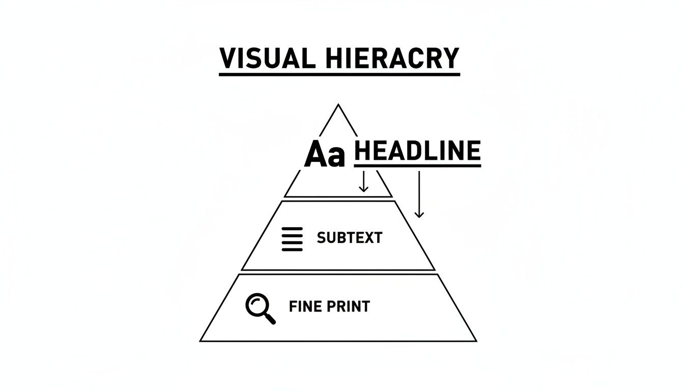
Think of it like a pyramid. The most important information needs the most visual weight at the top to do its job right.
3. Typography
Typography is so much more than just picking an interesting font. It’s about using font weight (bold, regular, light), style, and size to create clear levels of information. A solid typographic hierarchy is like a roadmap for the reader's eyes.
A simple three-level system usually does the trick:
- Level 1 (Headline): This is your main message. Make it the largest and boldest text.
- Level 2 (Subheadings): These break up the content and add context. They should be smaller than the headline but bigger than the main text.
- Level 3 (Body Copy): This is the core information, set in a clean, readable font that's easy on the eyes.
By making these levels distinct, you turn a wall of text into something people can scan and actually understand in seconds.
4. Alignment
Alignment is the invisible glue holding your design together. When all your elements are properly aligned, the design feels organized, intentional, and professional. Get it wrong, and things just look messy and chaotic.
Most of the time, you'll want to left-align your text, since that's how we naturally read. Centered alignment can work for a short headline, but it's difficult to read in longer paragraphs. Good alignment creates clean lines and a visual connection between elements, even if they're on opposite sides of the graphic.
5. Proximity
The principle of proximity is simple: things that are close together are seen as a single group. It’s an easy way to organize information and make your design feel less cluttered.
For instance, you'd place an icon right next to the text it represents. You'd keep a caption tight to the image it's describing. By grouping related items, you create logical relationships that help the viewer process information instantly, without having to guess what goes with what.
6. Whitespace
Whitespace, sometimes called negative space, is just the empty area around all your design elements. Far from being "wasted" space, it's actually one of your most critical tools for creating a clean design and a clear hierarchy.
Whitespace does a few key things:
- It reduces clutter: Giving elements room to breathe makes the whole design feel less stressful and more approachable.
- It boosts readability: Good spacing between lines and paragraphs of text makes it way easier to read.
- It creates focus: Want to draw attention to one specific thing? Surround it with a generous amount of whitespace. It's like putting it on a stage.
Remember, a crowded design is a confusing design. Don't be afraid to embrace the emptiness.
7. Repetition
Repetition is what creates consistency and rhythm in your design. When you repeat things—like colors, fonts, shapes, or even spacing—you build a sense of familiarity that makes your design easier to navigate and understand.
In a multi-slide Instagram carousel, for example, you'd repeat the placement of the headline and the slide number on every single slide. This consistency creates a seamless, professional experience, reassuring the viewer and helping them follow along without even thinking about it.
To help you remember these, here’s a quick breakdown of what each principle does at its core.
Key Principles of Visual Hierarchy at a Glance
| Principle | Primary Function | Example Application |
|---|---|---|
| Size & Scale | Attract attention and signal importance. | Making the main headline the largest text element on the graphic. |
| Color & Contrast | Create emphasis and evoke emotion. | Using a bright, contrasting color for a call-to-action button. |
| Typography | Organize text into a readable hierarchy. | Using bold, large fonts for headers and smaller, plain fonts for body text. |
| Alignment | Create structure and order. | Aligning all text to a single vertical line for a clean, organized look. |
| Proximity | Group related elements together. | Placing an image caption directly underneath the image it describes. |
| Whitespace | Reduce clutter and create focus. | Surrounding a key logo or element with ample empty space. |
| Repetition | Create consistency and unity. | Using the same font and color for all headlines in a multi-slide carousel. |
These principles aren’t meant to be used in isolation; the magic happens when they work together. A great design is a careful balance of all these elements, guiding the viewer's eye on a planned journey from the most important message down to the finest detail.
Applying Visual Hierarchy to Social Media Graphics
So, you understand the theory behind visual hierarchy. But how do you actually use it in the trenches of Instagram or LinkedIn, where you have milliseconds to stop someone's thumb?
This is where the rubber meets the road. Your graphic isn't just a pretty picture; it's a tool fighting for attention in a ridiculously crowded feed. Each type of post—from a multi-slide carousel to a data-packed infographic—needs its own strategic approach to hierarchy.
Get it right, and people don't just stop scrolling; they actually understand what you're trying to say. Get it wrong, and you might as well be invisible. Considering 85% of our brain's processing is visual, a design with a weak structure can lead to a 50% loss of your intended message. That's a costly mistake.
Crafting a Narrative in Multi-Slide Carousels
Think of carousels as mini-stories. Their success lives or dies by a consistent visual flow that encourages the user to swipe to the next slide. The whole point is to create a seamless journey from start to finish.
Repetition is your best friend here.
- Consistent Header Placement: Lock your main headline in the same spot on every slide. This creates a predictable rhythm, letting your audience focus on the new info without having to re-learn the layout each time.
- Unified Typography: Stick to the same font hierarchy (headline, subhead, body text) all the way through. This is what makes a 10-slide carousel feel like one cohesive piece instead of 10 random images.
- Repeating Visual Cues: Use recurring elements like slide numbers, your logo, or a specific brand shape. These little anchors make the experience feel intuitive and professional.
Designing Clear and Scannable Listicles
Listicles are all about speed and digestibility. People love them because they promise quick, organized information. Your visual hierarchy needs to communicate clarity and scannability. Someone should be able to glance at it and immediately understand the structure.
Proximity and alignment are everything. You need to group related bits of info together and arrange them in a clean, logical line that the eye can follow effortlessly.
A great listicle uses visual hierarchy to make information feel less like a wall of text and more like a set of clear, organized steps. The design itself should communicate order and simplicity.
Here's how to build a listicle that people actually read:
- Use Numbers or Icons: Make your numbers or icons big and bold. They should be the first thing the eye catches for each point, instantly signaling the format.
- Leverage Proximity: Keep the headline for each point snug against its number and description. This creates tight visual groups that the brain can process in a snap.
- Employ Whitespace: Be generous with the empty space between each list item. This negative space is what prevents your design from feeling cramped and helps each point stand out on its own.
Highlighting Key Data in Infographics
Infographics exist to make complex data look simple and engaging. A rock-solid visual hierarchy is your only hope for guiding someone through a bunch of stats without making their eyes glaze over. The main goal? Create one or two undeniable focal points that communicate the most important takeaway.
This is where you pull out the big guns: size, scale, and contrast.
For example, if you're showcasing one key statistic, make that number massive—way bigger and bolder than anything else on the graphic. Use a high-contrast color so it's physically impossible to ignore. Supporting details and data sources should be smaller and less prominent, creating a clear order of importance: main insight, supporting context, and the fine print.
And remember, when you're designing for platforms with their own UI, knowing the layout constraints is crucial. Using a tool like an Instagram Safe Zone Checker ensures your most important elements don’t get awkwardly cut off.
By tailoring these strategies to the format, you can turn basic social media images into seriously effective communication tools. If you want to fast-track the process, check out our guide on social media graphics templates. It’s a great starting point for building designs that work.
A Step-By-Step Workflow for Building Hierarchical Designs
Knowing the principles of visual hierarchy is one thing. Actually using them consistently so your designs don't look like a chaotic mess is another thing entirely.
Having a repeatable workflow takes the guesswork out of it. It turns abstract ideas like "focal point" into a practical, step-by-step checklist. This approach ensures every design you create is clear and effective, whether you're a seasoned pro or a small business owner creating your own social media graphics.
This five-step framework is a reliable way to turn a random collection of text and images into a cohesive, professional-looking design that gets your message across.
Step 1: Define Your Primary Message
Before you even think about fonts or colors, you have to answer one brutally simple question: What is the single most important thing I want my audience to know or do?
Is it to learn one key fact? Click a link? Understand a massive benefit? This one thing is the entire reason your design exists.
Everything else you add is just a supporting actor. If you try to make everything important, nothing will be. Be ruthless here. Your design's clarity depends on it.
A design without a clear primary message is like telling a story with no plot. Your primary message is your design's north star.
Step 2: Rank Your Content Elements
Okay, you’ve got your main message. Now it’s time to organize your content. Make a list of every single thing that needs to be on the canvas—headlines, body text, images, icons, a call-to-action, your logo, your website URL. Everything.
Now, rank them in order of importance.
- Primary Elements (Must-See): This is your main headline or the key data point that screams your primary message. It’s the hero of your design.
- Secondary Elements (Should-See): These are the supporting details. Think subheadings, short explanations, or key images that give context to your main point.
- Tertiary Elements (Can-See): This is the fine print. Your company logo, social media handle, or other background info. They need to be there, but they shouldn't be fighting for the spotlight.
This ranking system is the blueprint for your visual hierarchy.
Step 3: Establish a Strong Focal Point
Your #1 element from Step 2 is now your design’s focal point. This is the anchor that grabs the viewer's eye first. Your job is to give it as much visual weight as possible.
How? Make it the biggest thing on the canvas. Use a high-contrast color so it pops. Use a bold, attention-grabbing font. Your goal is to make it physically impossible for someone to look at the design and not see this element first. This is the entry point to your entire message.
Step 4: Arrange Supporting Elements
With your focal point in place, it's time to position the rest of the team. Use the other hierarchy principles to arrange your secondary and tertiary elements so they support the main message without stealing the show.
Use alignment to create a clean, organized structure that doesn't feel chaotic. Use proximity to group related items together, like an icon and its caption. And be generous with whitespace. Let your design breathe so it doesn't feel cluttered and overwhelming. This is where you create the visual path that guides the viewer’s eye from your focal point through the rest of the information.
Step 5: Refine and Test for Clarity
Last step. Take a step back from your screen and test your work. The easiest way is the squint test.
Squint your eyes until the design becomes a blurry mess. What elements still stand out? If it’s your focal point, you nailed it. If other, less important elements are still competing for attention, you need to dial back their visual weight.
This workflow turns design from an intimidating art into a logical process. Follow these steps, and you’ll consistently create visuals that don’t just look good, but actually work.
Common Visual Hierarchy Mistakes and How to Fix Them
Knowing the rules of visual hierarchy in graphic design is one thing, but actually spotting the mistakes in your own work? That’s a different ballgame. It’s easy to get lost in the details and end up with a design where a killer message gets completely buried.
Learning what not to do is just as powerful as mastering the principles. Once you can spot these common pitfalls, you can quickly turn a confusing graphic into something clean, professional, and effective.
Mistake 1: No Clear Focal Point
This is the big one. It's what happens when you try to make everything important at once. The headline is big, the image is bright, the call-to-action is bold—and now they’re all screaming for attention at the same time. The result? A wall of visual noise that makes people’s brains hurt.
When a viewer doesn’t know where to look first, they just won't look at all. They'll keep scrolling. If your design feels chaotic or like every element is fighting for the spotlight, this is probably your problem.
How to Fix It: Before you even start designing, ask yourself: "What's the one thing I need someone to see?" Make that your undisputed hero. Make it way bigger, bolder, or give it a color that pops off the screen. Everything else should just be a supporting actor.
Mistake 2: Poor Color and Contrast Choices
Ever seen light gray text on a slightly-less-light gray background? It’s a designer’s nightmare. Using colors that are too similar or failing to create enough separation makes your content a chore to read. Low contrast is a guaranteed way to lose your audience because you're literally making them strain their eyes.
This usually happens when designers fall in love with a trendy, low-contrast color palette without thinking about function. Remember, your design's first job isn't to look cool—it's to communicate clearly.
Simple Contrast Solutions:
- Text on Images: If you're putting text over a busy photo, always add a dark color overlay behind it (or a light one if the text is dark). This creates a clean backdrop and makes your words instantly legible.
- The Grayscale Test: Flip your design to grayscale. Do your key elements and text fade into the background? If so, your contrast is too weak.
- Call-to-Action: Your main button needs to be the most obvious thing on the page. Use a high-contrast color that makes it impossible to miss.
Mistake 3: Cramming Too Much Information
Another classic mistake is trying to stuff an entire novel's worth of text, icons, and images into a single graphic. The urge to include every single detail is strong, but it always backfires, leaving you with a design that feels cramped, overwhelming, and totally unapproachable.
Whitespace (or negative space) is not wasted space. It’s an active, powerful design tool that gives your content room to breathe, guides the viewer’s eye, and instantly makes everything feel more organized and professional.
Solutions for a Cluttered Layout:
- Embrace Whitespace: Be generous with the empty space around your most important elements. It’s like putting a spotlight on them.
- Be Ruthless with Content: If a word, icon, or image doesn’t directly support the main message, cut it. Be merciless.
- Break It Up: If you have a lot to say, don't try to cram it all into one square. Use a multi-slide carousel. This gives each point its own dedicated space to shine.
Common Hierarchy Mistakes and Their Solutions
Even seasoned designers slip up sometimes. This table is a quick-reference guide to help you diagnose and fix the most common hierarchy issues that can sabotage an otherwise great design.
| Common Mistake | Impact on Design | How to Fix It |
|---|---|---|
| Everything Is Bold | When everything screams for attention, nothing gets heard. The viewer is overwhelmed and the core message is lost. | Pick one hero element (headline, stat) to be significantly larger or bolder. Demote everything else to a supporting role. |
| Inconsistent Spacing | The design looks sloppy and disorganized. Elements either feel like they are floating apart or crammed too tightly together. | Use a grid or alignment guides. Group related items close together (proximity) and add generous space between unrelated groups. |
| Weak Contrast | Text is hard to read, buttons don't stand out, and key information blends into the background, causing user frustration. | Use a contrast checker tool. Place light text on dark backgrounds (and vice versa) or use color overlays on images. |
| Too Many Fonts/Styles | The design feels chaotic and unprofessional. It lacks a clear typographic hierarchy, making it hard to scan. | Stick to 2 fonts maximum (one for headers, one for body). Use font weight (bold, regular) and size to create clear levels of importance. |
| Ignoring Reading Patterns | Users can't find the information they're looking for because the layout doesn't follow a natural F-Pattern or Z-Pattern flow. | Place your most important element at the top-left or center. Position your call-to-action along the natural reading path (bottom-right). |
| No "Breathing Room" | The layout is cluttered and claustrophobic, making it difficult for the user to focus on what matters. | Increase the whitespace (negative space) around all key elements. Be ruthless and remove anything that isn't essential. |
Treat this as your go-to checklist. Before you hit publish, run through these points. A few small tweaks can often be the difference between a graphic that gets ignored and one that gets results.
Automate Perfect Hierarchy with AI
Getting visual hierarchy in graphic design right takes time. It requires a trained eye and hours of fiddling with font sizes, color palettes, and spacing just to make things look professional.
If you're a small business owner, creator, or a social media manager juggling multiple clients, you don't have that kind of time. This is exactly where AI design automation tools can help. Instead of starting from a blank canvas, you can use an AI agent that handles the entire visual creation process for you—no prompts required.
How AI Automates Visual Content
Tools like Postbae are built to autonomously create professional social media graphics, such as multi-slide carousels and educational infographics. The AI agent understands design principles and applies them automatically.
The system takes care of all the tedious work:
- It intelligently applies the rules of scale, contrast, and alignment so you don't have to.
- It matches industry-specific content with proven layouts that naturally guide your audience's eyes.
- It programmatically generates complete visual posts without you needing to manually adjust a thing.
The result? A consistent stream of professional visual content that looks like it came from a dedicated designer. You get high-impact social media graphics that build authority, without the steep learning curve.
Best of all, automation doesn't mean you lose creative control. Every visual post the AI generates is fully customizable. You can jump in and tweak any element to perfectly match your brand’s style. To see how this works, our guide on using an AI social media content generator can show you how to get quality visuals without the headache.
Got Questions About Visual Hierarchy? We've Got Answers.
Alright, let's wrap this up by tackling some of the questions that always pop up when people start putting visual hierarchy in graphic design into practice. Think of this as your quick-reference cheat sheet to build confidence and start designing smarter, not harder.
How Do I Figure Out the Most Important Thing in My Design?
Start by asking yourself one simple question: "If my audience only remembers one thing from this graphic, what should it be?" Is it the 50% off discount? The shocking statistic? The call-to-action to download your guide?
Whatever that one thing is, that's your hero. That’s the element you’re going to give the VIP treatment—make it the biggest, the boldest, or hit it with a blast of contrasting color. It needs to be the first thing people’s eyes snap to when they see your design.
Can My Design Have More Than One Focal Point?
Technically, yes, but tread carefully. You can have a primary focal point and then maybe a secondary one, but if you have too many things screaming for attention, you end up with chaos. It’s like having three people trying to talk to you at once—you just tune everything out.
Best practice? Establish one dominant focal point to grab that initial scroll-stopping attention. Then, use secondary points of interest with less visual weight (think smaller text or a less vibrant color) to guide their eyes through the rest of the information. It creates a path, not a mosh pit.
How Big of a Deal Is Whitespace on Social Media Anyway?
It’s a massive deal. Your social media feed is a crowded, noisy, visual battlefield. Whitespace (or negative space) is your secret weapon for creating a design that feels calm, professional, and actually readable.
It gives your elements room to breathe, groups related items together, and cuts down on that “ugh, this is too much work to read” feeling. Use it strategically to make your most important elements, like your call-to-action, the undeniable star of the show.
A graphic that feels 'breathable' is far more likely to stop the scroll than one that’s a visual mess. Use whitespace to give your key message the spotlight it deserves.
Ready to create authority-building social media graphics with perfect visual hierarchy, but without all the manual effort? The AI agent at Postbae autonomously generates professional carousels, infographics, and more, so you can focus on growing your business. Get stunning, effective visuals on autopilot at https://postbae.com.