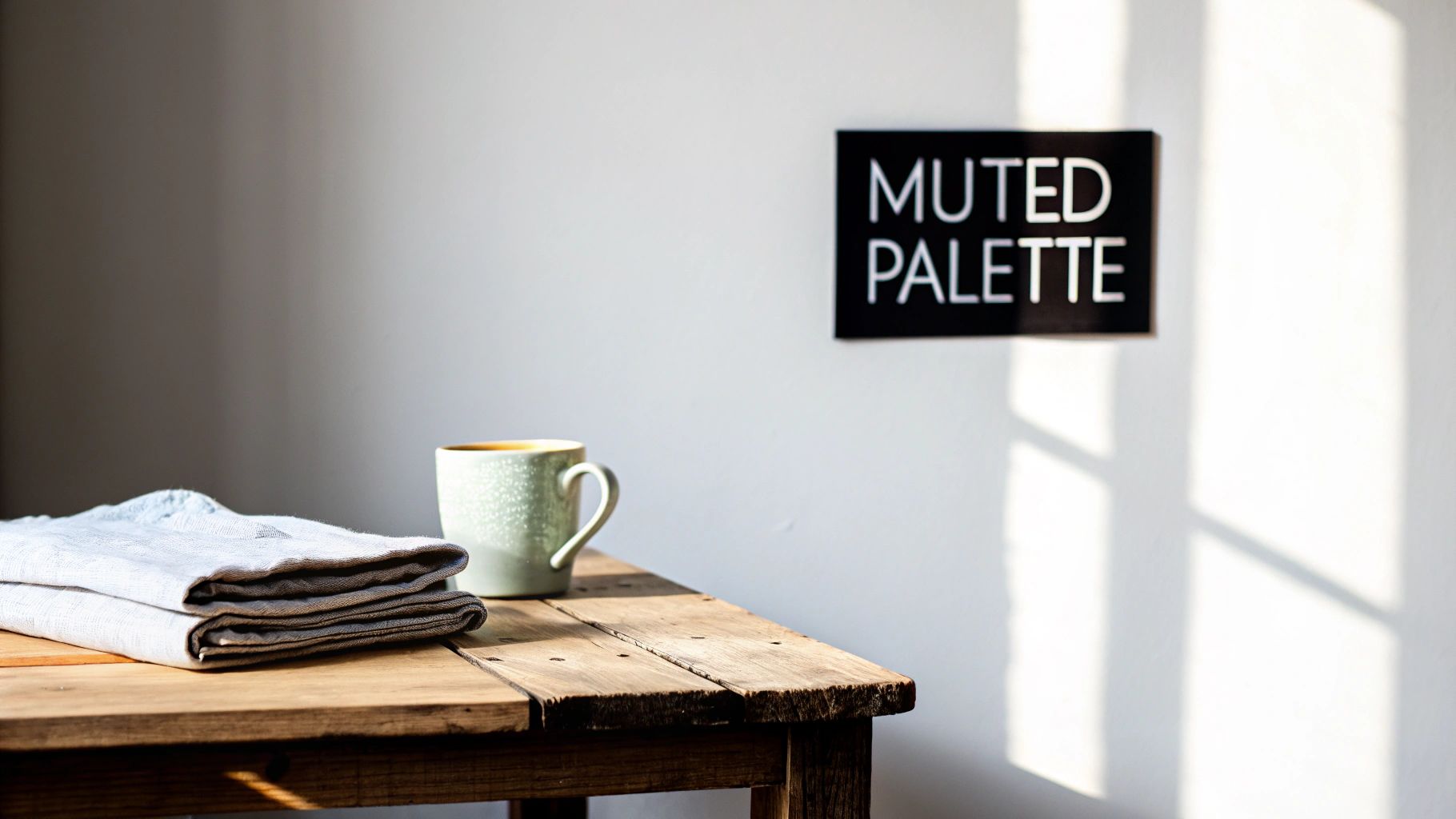
A Guide to Using a Muted Color Palette in Design

Discover how a muted color palette can elevate your brand. Learn the psychology, creation process, and best practices for using these sophisticated tones.
A muted color palette is simply a color that's had its intensity turned down. You get there by mixing a pure hue with grey, black, or white. The result? A softer, more understated look that feels instantly calm and sophisticated.
What Is a Muted Color Palette and Why Does It Work?
Imagine the difference between a bright, cloudless summer day and a cool, foggy morning. The sunny day is packed with intense, vibrant colors that practically scream for your attention. That foggy morning, on the other hand, is all about soft, desaturated tones that feel peaceful and quiet.
A muted color palette works just like that foggy morning—it dials down the visual noise.
This deliberate choice to dial back the color intensity is a surprisingly powerful design move. It creates an atmosphere of elegance, authenticity, and timelessness. Instead of hitting your audience over the head with bright, loud colors, muted tones invite them to lean in, look closer, and really connect with your message.
The Strategic Advantage of Subtlety
The real genius of a muted color palette is its psychological impact. Because these colors aren't fighting for the spotlight, they let other design elements—like your typography, photography, or core message—truly shine. In a way, this subtlety is a huge sign of confidence.
A muted palette doesn’t shout for attention; it earns it through sophistication and balance. It signals to the audience that the content or product is strong enough to stand on its own without needing flashy colors to make an impact.
This approach is fantastic for shaping how people see your brand. It can make a brand feel more established, trustworthy, and even a bit high-end. For anyone looking to build authority, using a muted scheme in your visual content for social media creates a professional, cohesive look that connects with people who value quality and expertise.
So, why does this subtle approach work so well? A few key reasons stand out:
- It Creates a Calm Atmosphere: Muted tones are naturally relaxing. This makes them a perfect fit for wellness, lifestyle, and luxury brands.
- It Enhances Readability: With less visual clutter from loud colors, text and important information become much easier to read and digest.
- It Suggests Authenticity: Desaturated colors often feel more natural and grounded, helping you build a connection based on genuine trust.
- It Provides Timeless Appeal: Bright, trendy colors can look dated in a hurry. A muted palette, however, almost always feels classic and built to last.
The Psychology Behind Muted Colors in Branding
The colors a brand picks are never just a random choice. They're a deliberate move, carefully planned to shape how people see them and build a real connection. While bright, flashy colors yell for attention, a muted palette speaks in a calm, confident whisper. This approach sends a powerful signal about a brand's character and what it stands for.
Desaturated tones often feel more authentic, sophisticated, and trustworthy. By turning down the "visual volume" of hyper-bright shades, a muted palette suggests that the product or service is so good, it doesn't need to shout. It’s a visual cue for stability and substance, reassuring customers that this is a brand they can rely on.
This is exactly why so many high-end and heritage brands gravitate toward these colors. It’s not just a hunch; an experiment on color saturation and brand perception actually found a direct link between lower saturation and a higher perceived status. In other words, when people see soft beiges, deep neutrals, and understated grays, they instinctively associate the brand with a greater sense of history and quality. You can learn more about these findings on color saturation and brand status and see the data for yourself.
Building Trust and Sophistication
Different industries have figured out how to use this psychological shortcut to their benefit. A luxury fashion house might pair charcoal and beige to project timeless elegance. A financial advisory firm, on the other hand, could use deep, muted blues to communicate stability and integrity. The common denominator here is a strategic shift away from fleeting trends toward something more lasting and dependable.
By choosing a muted color palette, brands can create a sense of calm and clarity. This allows their core message to resonate more deeply with an audience that values quality over flash.
This tactic is especially effective for businesses trying to position themselves as experts in their field. Think about a wellness app that uses soft greens and gentle blues in its design. It instantly creates a serene, relaxing experience that perfectly matches its mission. The colors become an integral part of the product's value.
Connecting with the Right Audience
At the end of the day, a muted color palette helps attract a specific kind of person—one who is often more thoughtful and less impressed by loud, aggressive marketing. These are the customers looking for brands that mirror their own values, like sophistication, mindfulness, and authenticity.
You’ll see this approach used all the time in certain fields:
- Luxury Goods: To convey exclusivity and premium quality.
- Wellness and Spa Services: To create a tranquil and restorative atmosphere.
- Professional Services (e.g., legal, finance): To project trustworthiness and expertise.
- Artisanal and Craft Products: To highlight natural materials and a genuine, handmade feel.
By carefully choosing and applying a muted color palette, brands can build a powerful identity that fosters trust, communicates a sense of heritage, and connects with a discerning audience that’s looking for substance, not spectacle.
How to Create Your Own Muted Color Palette
Building a gorgeous muted color palette isn't about guesswork; it's a thoughtful process of dialing down the intensity of colors to hit just the right emotional note. It’s more art than science, but following a few key steps can help you craft a sophisticated palette that feels authentic to your brand.
Think of it as a simple, four-part recipe. We'll walk through it step-by-step, taking the mystery out of the process and giving you a solid framework for creating professional-looking color schemes every time.
Start With a Strong Base Color
Every memorable color palette starts with a single anchor—a foundational color that captures the very essence of your brand's personality. Before you do anything else, ask yourself: what do I want people to feel? Is it the calm confidence of a deep blue, or the earthy, handcrafted vibe of a warm terracotta?
This first choice is your most important one. It sets the tone for everything else, so pick a color that truly speaks to your brand’s core identity.
Mute Your Base Color by Desaturating It
Got your base color? Great. Now it's time to give it that signature muted quality. "Muting" is just a fancy word for reducing a color's intensity or saturation. You can do this in three main ways, and each one gives your color a slightly different personality.
The idea is to soften the color, pulling back its vibrancy without completely stripping away its character. This is the magic step that turns a basic hue into the cornerstone of a sophisticated muted palette.
Here's a quick look at the three ways you can mute a color. Each involves mixing your base with a neutral, and the neutral you choose completely changes the outcome.
Muted Palette Creation Methods
| Method | What You Add | Resulting Effect | Best For |
|---|---|---|---|
| Tone | Add Grey | Creates a classic, sophisticated muted color that feels balanced and grounded. | Achieving a timeless, understated, and professional feel. |
| Tint | Add White | Produces a lighter, airier pastel version of your color, often feeling soft and delicate. | Creating a gentle, serene, and calming atmosphere. |
| Shade | Add Black | Results in a deeper, richer, and more dramatic version of your hue. | Conveying depth, luxury, and a sense of seriousness. |
Each method offers a different path to get that soft, desaturated look you're after. Experiment to see which one best fits the mood you want to create.
Build Out a Harmonious Palette
Now that you've muted your base color, it's time to build a team of colors around it. A great way to do this is by picking colors that are either next to your base on the color wheel (analogous) or directly opposite it (complementary).
Once you have these new colors, apply the exact same muting process you used on your base. If you added grey to your main color, add grey to the others. This consistency is the secret sauce that makes a palette look cohesive and intentional. This kind of visual harmony is critical when you learn how to create social media content that looks polished and professional.
To finish, you’ll need a neutral color to tie everything together. Think off-white, a soft beige, or a light charcoal grey. This neutral acts as a resting place for the eyes, giving your main colors room to shine and working perfectly for backgrounds or text.
If you’d rather skip the manual work, AI-driven tools like Postbae can be a massive shortcut. The system can generate complete, on-brand visual posts using professionally designed muted palettes. Its AI agent works autonomously to create authority-building graphics like carousels and infographics, saving you hours of design time while ensuring every post is perfectly harmonized. You still have full editing control to fine-tune the results, giving you the perfect blend of automation and creative freedom.
3 Muted Palettes to Get You Started
Staring at a blank color wheel can be intimidating. Sometimes, the best way to get the creative juices flowing is to start with a few solid, ready-to-use examples. Think of these as a jumping-off point—a way to see how these desaturated tones play together in the real world.
I’ve pulled together three distinct palettes below, each with its own vibe and personality. They’re complete with hex codes, so you can plug them directly into your design tools and start playing around right away.
Earthy and Organic
This palette feels like a deep breath of fresh air. It’s grounded, warm, and incredibly welcoming, drawing its inspiration straight from the natural world. If you’re a wellness brand, an eco-conscious company, or just want to create a space that feels calm and authentic, this is a beautiful place to start.
- Sage Green: #A3B899
- Terracotta: #C48575
- Warm Taupe: #B3A094
- Creamy Off-White: #F5F1ED
- Soft Charcoal: #4E4B48
Modern and Minimalist
Sleek, sophisticated, and quietly confident. This palette is all about clean lines and an uncluttered feel, using cool neutrals to project an image of elegance and precision. It’s a natural fit for tech companies, architectural firms, or any brand that values a polished, modern aesthetic. You can see great examples of soft neutral color applications in fashion that capture this exact vibe.
- Charcoal Grey: #3D4045
- Cool Stone: #ADB1B8
- Pale Grey: #E4E6E8
- Off-White: #F9F9F9
- Deep Navy: #333A56
Soft and Dreamy
Light, airy, and full of gentle romance. This palette uses soft, desaturated pastels to create a sense of whimsy and creativity. It’s perfect for lifestyle bloggers, wedding planners, artists, or anyone whose brand identity is built on being delicate and approachable.
- Dusty Rose: #D6BABA
- Powder Blue: #B2C6D6
- Lavender Haze: #CBC1D5
- Ivory: #FAF6F1
- Misty Grey: #C4C4C4
Remember, muting a color is simply about dialing down its intensity. You can do this by adding a touch of grey (creating a tone), white (a tint), or black (a shade).
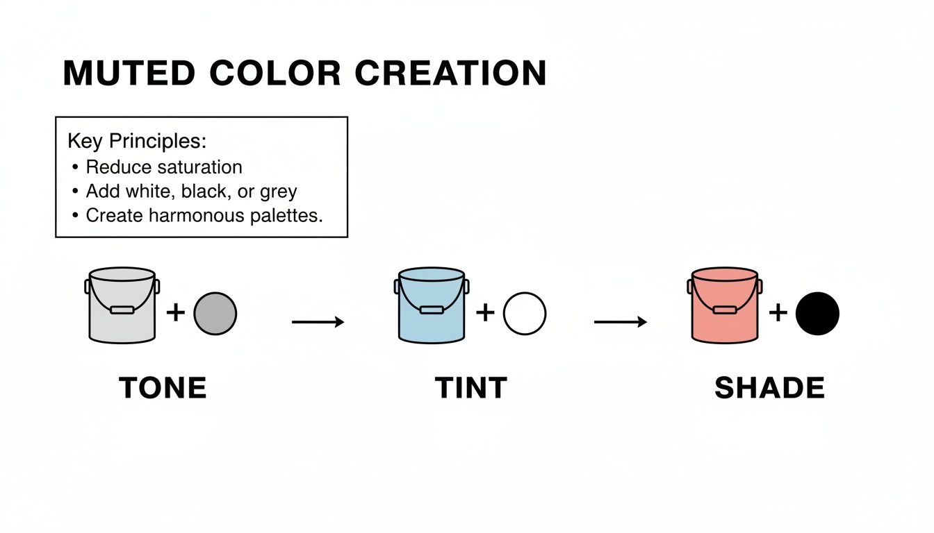
This simple diagram shows exactly how it works. It’s a straightforward technique, but mastering it gives you incredible control over the mood of your designs.
When you understand how to mute colors effectively, every choice becomes intentional. You're no longer just picking colors—you're crafting an experience.
Of course, consistency is everything. This is where tools like Postbae really shine. Its AI agent can automatically generate on-brand visual content, including multi-slide posts, that strictly follows your muted color palette. If you want to see how this works in practice, check out this guide on how to create Instagram carousels with a cohesive look. It saves you countless hours while ensuring every single graphic feels like it came from the same hand.
A Quick Look at Color Trends, Then and Now
The love for muted color palettes isn't just some passing fad; it's a design choice with a rich history that has found a new home in our digital world. If you look back, you'll see these softer, understated tones pop up time and time again, proving they have a classic, almost cyclical, appeal. Their staying power comes from their unique ability to set a specific mood, whether on a printed page, in a piece of clothing, or on a screen.
Subdued colors have actually defined entire decades. In the 20th century, you can see muted palettes taking center stage in a few key periods. Think of the soft pastels on everything from kitchen appliances to cars in the 1950s and 1970s. Then, fast forward to the 1990s, which saw a major shift toward more "sober and muted" tones in TV shows and fashion. If you're curious about this pattern, you can explore detailed color trend analyses that dig into why these trends keep coming back. This history proves that muted colors aren't a new invention—they're a timeless tool that designers rely on for a touch of calm sophistication.
Muted Colors in the Digital Age
This classic appeal has moved smoothly into the online world, where muted palettes are now a go-to for modern UI and UX design. And it's not just about looking good; it's incredibly practical. With all of us spending so much more time glued to our screens, designers are putting a real emphasis on making that experience comfortable.
In digital design, a muted color palette is a strategic choice that balances beauty with usability. It reduces visual fatigue and makes content easier to consume, creating a more pleasant and accessible user experience.
One of the biggest reasons for this shift is the rise of Dark Mode. Interfaces using dark mode depend almost entirely on muted colors against a dark background to cut down on eye strain, especially when you're scrolling in a dimly lit room. Those softer tones take the edge off the harsh glare of a bright white screen, which makes for a much more comfortable experience over long periods. This focus on readability and comfort is exactly why muted palettes are everywhere now—in our apps, on websites, and across operating systems.
What Muted Palettes Say About Modern Brands
Beyond just being easy on the eyes, muted colors are a powerful way for brands to communicate their values. Color psychology is a real thing, and smart brands use it to build an emotional connection.
- Earthy Greens and Browns: You'll see these a lot with sustainability and wellness brands. They instantly bring to mind nature, tranquility, and an eco-friendly mindset.
- Soft Blues and Greys: Tech companies and B2B services love these. They project a feeling of trust, stability, and clean, no-fuss efficiency.
- Warm Beiges and Terracottas: These are a favorite for lifestyle and home decor brands because they feel warm, cozy, and authentic.
By carefully picking a muted color palette, a brand can quietly signal what it stands for, creating a stronger bond with its audience. It’s a thoughtful strategy that makes sure the design isn't just attractive, but also meaningful.
Ensuring Accessibility with Muted Colors
A beautiful muted color palette is only truly successful if everyone can appreciate it. While these soft, desaturated tones are known for creating a calm and sophisticated look, they can easily create readability problems if you're not careful. Making your design accessible means ensuring there's enough contrast for users with visual impairments to comfortably read your text and understand your graphics.

The trick is to find that sweet spot between aesthetic appeal and functional clarity. A thoughtfully designed muted palette can even improve accessibility by cutting down on the harsh glare you get from super-saturated colors. But that only works if you manage contrast from the very beginning.
Mastering Contrast for Readability
The Web Content Accessibility Guidelines (WCAG) are the gold standard here. They provide clear benchmarks for color contrast to make sure text is legible for people with various forms of color blindness and low vision.
The most common mistake I see with muted palettes is pairing two colors that are too similar in lightness. Think light grey text on a pale, dusty rose background. It might look elegant at a glance, but it will almost certainly fail accessibility tests, making it a frustrating experience for many people.
Accessibility isn't a limitation on creativity; it's a framework for inclusive design. A successful muted palette proves that elegance and readability can coexist beautifully.
To steer clear of these issues, you just need to get in the habit of checking your color pairings. Here are a few simple practices to follow:
- Pair Light and Dark Tones: This is the most straightforward rule. Always combine a light muted color from your palette with a dark one for text and backgrounds. A deep charcoal for your text on a soft beige background is a classic example that works.
- Test Your Contrast Ratios: Don't just eyeball it! Use a free online contrast checker. Just pop in the hex codes for your foreground and background colors, and it will tell you instantly if you meet WCAG standards.
- Avoid Problematic Combinations: Be especially wary of tone-on-tone pairings. A medium sage green on a slightly lighter sage background might feel cohesive, but it’s often a recipe for poor readability.
Interestingly, some research shows that themes with low luminance—which often means muted colors on darker backgrounds—can boost readability for people with certain visual impairments and may even reduce eye strain.
Ultimately, a great design is one that welcomes everyone. For a deeper dive into the technical side of things, resources that cover color conversions, palette building, and accessibility checks can be a huge help.
Got Questions? We've Got Answers
Still have a few lingering questions about working with muted color palettes? Let's clear up some of the most common ones.
Can a Muted Color Palette Actually Grab Attention?
Absolutely. The power of a muted palette isn't in shouting; it's in its sophisticated charm. Think of it less like a neon sign and more like a beautifully composed photograph that pulls you in with its quiet elegance and calm.
To make sure your design pops, lean into strong composition, beautiful typography, and plenty of contrast between your text and background. That's what really makes people stop and look.
What Kinds of Businesses Should Use a Muted Palette?
While they're incredibly versatile, muted palettes are a natural fit for brands in the wellness, luxury goods, and high-end service industries. Think spas, artisan coffee shops, boutique hotels, and creative professionals like photographers or interior designers.
These fields thrive on the exact feelings that muted tones inspire: trust, sophistication, and a sense of calm professionalism.
How Do I Stop My Muted Colors From Looking Boring or Flat?
The key is to build depth and contrast. Don't just use one or two shades; play with the full range of your palette, from its lightest tints to its deepest tones.
Bringing in textures, high-quality photos, and even a single, carefully chosen accent color can make all the difference. That small pop of a brighter hue is perfect for drawing the eye to important things like buttons or key highlights, creating a design that feels balanced and alive, not dull.
Ready to create stunning social media graphics with a perfectly balanced muted color palette—without all the manual design work? Postbae uses an AI agent to automatically generate professional, on-brand visual posts for your business. Get your scroll-stopping content at Postbae.com.