How to Create Instagram Carousels That Captivate Your Audience

Learn how to create Instagram carousels that boost engagement. Our guide covers everything from planning and design to publishing and performance tracking.
Crafting an Instagram carousel that captivates your audience is about more than just stringing a few images together. It's an art form. You're blending a clear story, a compelling design, and a deep understanding of your audience into one seamless, swipeable experience.
Your goal is to guide someone from a hook that stops their scroll, through a series of valuable slides, all the way to a final call-to-action. Done right, a simple post becomes an interactive journey.
Why Instagram Carousels Drive Unmatched Engagement
Before we get into the nitty-gritty of how to make them, let’s talk about why they work so well. Instagram carousels aren't just a visual trend; they're a strategic tool for increasing your engagement and cementing yourself as an expert.
Their interactive nature plays directly into what social media algorithms crave.
Think about it. The simple act of swiping is a more active experience than just double-tapping a single photo and moving on. This tiny interaction has a massive impact on dwell time—the amount of time someone actually spends looking at your post.
When dwell times are high, it’s a powerful signal to the Instagram algorithm that your content is valuable. The algorithm then rewards you by pushing your post out to a wider audience. This built-in advantage is exactly why carousels have become the go-to format for anyone serious about organic growth.
The Power of Multi-Slide Storytelling
Carousels give you the breathing room to tell a complete story, break down a complicated idea, or show off a product from every conceivable angle. This flexibility makes them incredibly effective for hitting different goals. You can deliver a mini-tutorial, build trust with a compelling before-and-after, or share a collection of photos from your customers.
The real magic of a carousel is its ability to deliver value in layers. Instead of trying to cram everything into one overwhelming graphic, you can walk your audience through a logical sequence, making your message more digestible and memorable.
The data supports this. Instagram carousel posts consistently outperform single-image posts, pulling in an engagement rate that can be up to 3.1 times higher. That's because they do more than just attract likes; they encourage saves and shares, which are high-quality content signals for the algorithm.
Carousel Post Types and Their Strategic Uses
The carousel format is incredibly versatile. To get your ideas flowing, here’s a quick rundown of some popular carousel types and where they shine.
| Carousel Type | Primary Goal | Best For |
|---|---|---|
| Educational Guides | Teach & Establish Authority | Step-by-step tutorials, "how-to" guides, breaking down complex topics. |
| Product Showcases | Drive Sales & Desire | Highlighting features, benefits, or use cases of a single product. |
| Storytelling | Build Connection & Trust | Sharing your brand's origin, a customer success story, or behind-the-scenes content. |
| Listicles | Deliver Quick Value | Presenting tips, resources, or interesting facts in a numbered or bulleted list. |
| Before-and-After | Demonstrate Results | Showing tangible transformations, perfect for service-based businesses. |
Mastering how to create Instagram carousels is a non-negotiable skill for any modern content strategy. If you want to dive deeper into audience interaction, you can explore various strategies to improve ad engagement, as many of the core principles apply here, too.
Mapping Your Carousel Content from Idea to Storyboard
A compelling carousel is built on a solid plan long before you think about fonts or colors. Many people jump straight into design and end up with a disjointed post that goes nowhere. The most effective carousels come from a clear strategy that turns one good idea into a story that flows.
First, define a single, razor-sharp objective. What is the one thing you want your audience to do or feel after they’re done swiping? Are you trying to teach them something new, show them a behind-the-scenes look, or get them excited about a new product? Every single slide has to serve that one core purpose.
And before you map out your slides, you need to know who you're talking to. A deep dive using What Is Audience Analysis in Modern Marketing? is essential. Understanding your audience’s pain points, interests, and existing knowledge lets you craft a message that resonates.
Building Your Narrative Arc
Think of your carousel like a mini-story. It needs a beginning, a middle, and an end. It's this narrative structure that hooks people and keeps them swiping. Without that logical flow, you’ll lose them by slide four.
A proven structure for a 10-slide carousel looks something like this:
- Slide 1: The Hook. This is your cover. It needs a magnetic headline and a visual that stops the scroll. Make a bold promise. Ask a provocative question. Make them need to know what's next.
- Slides 2-3: The Problem. Introduce a common pain point or challenge your audience is dealing with. This builds an instant connection and makes them think, "That's me!"
- Slides 4-7: The Solution. This is the core of your content. Break down your tips, tutorial, or solution into bite-sized, digestible points. Each slide should deliver a clear piece of value.
- Slides 8-9: The Transformation. Show them the "after" state. What does success look like? This could be a quick summary of the benefits, a powerful customer testimonial, or a visual showing the outcome.
- Slide 10: The Call-to-Action (CTA). End with a clear, direct instruction. Tell them exactly what to do next—save the post, drop a comment, or visit the link in your bio.
This process breaks down the key stages for building a carousel strategy that gets results.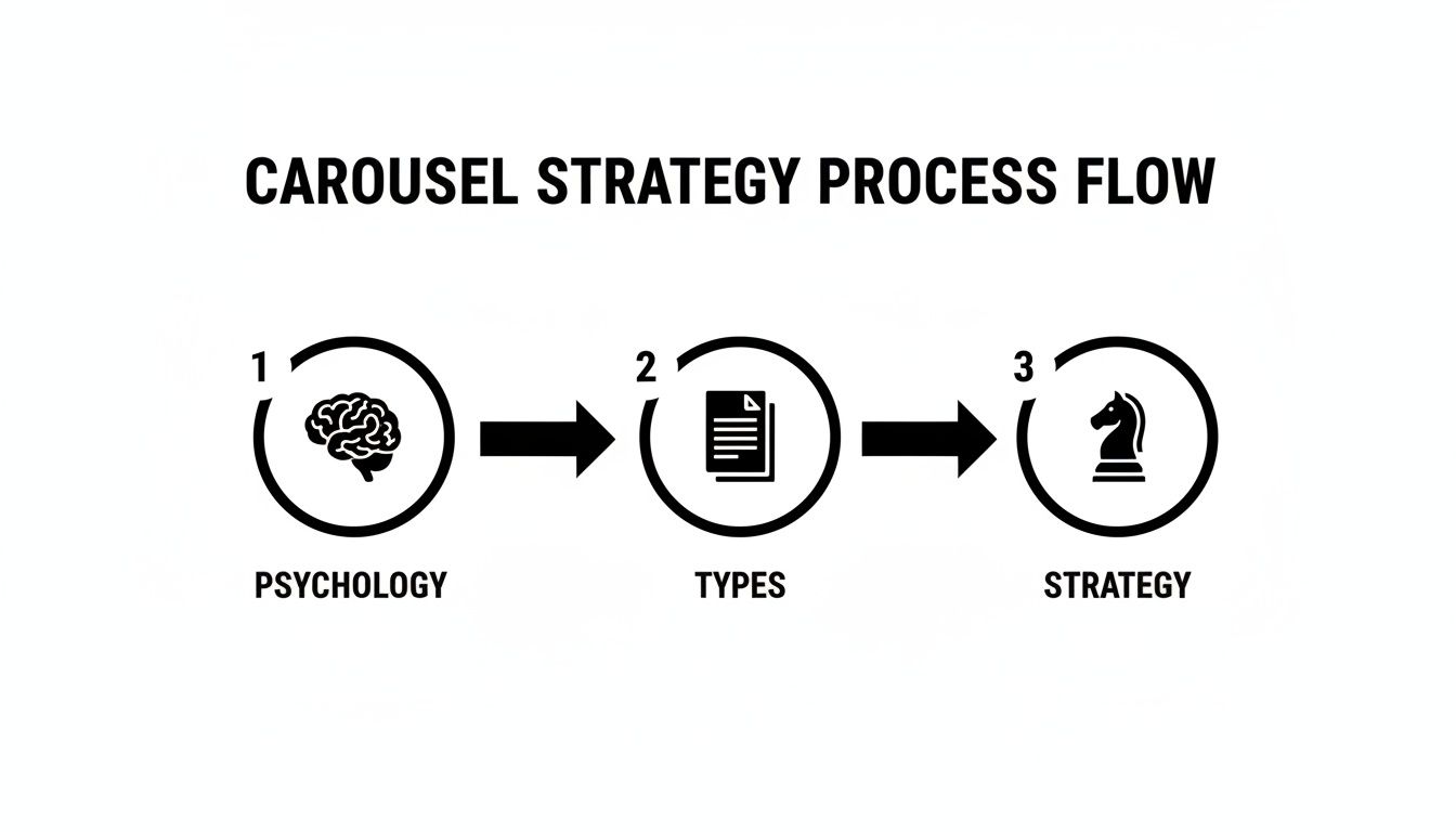
As you can see, a winning carousel is born from understanding audience psychology, picking the right content type, and then building out that strategic narrative.
From Outline to Storyboard
Once your narrative arc is locked in, it's time to storyboard. A storyboard is a simple, slide-by-slide plan that outlines the text and the visual concept for each frame. This doesn’t have to be a fancy design document—a basic text file or a spreadsheet works perfectly.
For each slide, map out these three things:
- The Core Message: What’s the single most important thing on this slide? Keep it brief.
- The Copy: Write out the exact text that will appear. Be ruthless with your word count. Less is more.
- The Visual Concept: Briefly describe the graphic, icon, or image you plan to use. This helps keep your visual theme consistent.
For instance, if a marketing agency is creating a carousel on "5 Common SEO Mistakes," their storyboard for slide four might look like this:
- Core Message: Neglecting local SEO is a missed opportunity.
- Copy: "Mistake #3: Ignoring Local Search. A whopping 76% of people who search for something nearby on their phone visit a related business within a day."
- Visual Concept: A simple map pin icon next to a magnifying glass.
Storyboarding is your content blueprint. It forces you to think through the entire user journey from start to finish, making sure every slide has a purpose and adds to the story. It’s the difference between a random list of tips and a powerful, persuasive narrative.
This planning stage is the secret to learning how to create Instagram carousels that consistently perform. It ensures your message is clear, your flow is logical, and your final post is perfectly structured to hit its goal. With a solid storyboard, you’re ready to jump into the design phase with confidence.
How to Design Carousels That Don't Look Like a Mess
The visual design of your carousel is critical. Once you've mapped out your content, the challenge is turning that storyboard into something professional, on-brand, and swipe-worthy. This is where many people get stuck, spending hours adjusting layouts, fonts, and colors.

Consistency is key. A cohesive design isn't just about aesthetics; it's about building brand recognition so people instantly know the post is from you. When every slide flows into the next, it makes the content feel effortless to read and digest.
This means sticking to a consistent color palette, using your brand fonts, and keeping a similar layout structure across the slides. Without that visual harmony, your carousel can feel disjointed and amateur, causing people to drop off before they reach your call-to-action.
The Challenge of Manual Design
Manually creating a 10-slide carousel from scratch can be a major time commitment. It demands a good eye for design, proficiency with graphic design software, and the discipline to maintain consistency from one slide to the next. For a busy social media manager or a business owner juggling multiple roles, this can be a serious bottleneck.
The typical manual process includes:
- Building a Master Template: Designing a foundational layout to adapt for each slide.
- Sourcing Visuals: Finding icons, images, or graphics that align with your brand.
- Positioning Elements: Carefully placing text and graphics for readability and balance.
- Endless Adjustments: Nudging elements until the layout looks just right.
This entire process can easily consume hours, pulling you away from other important work. This is exactly why many businesses are turning to automation to handle the heavy lifting.
Let Automation Handle the Visuals
Imagine if professionally designed, industry-specific carousels were created for you automatically, without you needing to open a design tool or write a single prompt. That’s the benefit of AI-powered automation in content creation.
Tools like Postbae are built to automate this entire workflow. Instead of providing a blank canvas, Postbae’s AI agent works autonomously to generate complete, multi-slide carousels. It researches topics relevant to your industry, writes the copy, and populates professionally designed templates with the content.
This approach completely eliminates the most tedious parts of the design process. You don't have to worry about the layout, typography, or finding the right visuals—the AI handles it, producing authority-building content that's ready to post. If you want to dive deeper into this, our guide on choosing a social media content creation tool has some great insights.
Automation isn’t about sacrificing quality for speed. It’s about using smart systems to handle the repetitive design work, freeing you up to focus on strategy and adding your unique touch. The goal is to get you 90% of the way there, instantly.
But You Still Have Creative Control
A common concern with automation is losing creative input. However, the best tools are designed to be a launchpad, not a final, unchangeable product.
With a platform like Postbae, every single element of a generated carousel is fully editable. You can tweak the text, swap out images, change colors to perfectly match your brand guide, and shuffle layouts around. It offers the best of both worlds: the speed of AI generation combined with the complete creative freedom of a manual design tool.
For instance, a marketing agency could use it to generate a carousel on "5 SEO Tips for Small Businesses." The AI might produce a polished, 7-slide post with solid content. The agency's social media manager can then jump in, add their logo, update a statistic with a recent case study, and tweak the final slide's CTA to promote their specific SEO audit service.
This way, even though the creation process is automated, the final post is uniquely yours and perfectly aligned with your brand's voice. It’s a powerful solution for small businesses and creators who need to produce high-quality visual content without a dedicated design team or hours to spare.
Writing Compelling Copy for Every Slide
The most beautiful carousel in the world is ineffective if the copy is boring. Your visuals might stop the scroll, but it's the words that get the swipe.
Think of your copy as the tour guide leading people through your content. Each slide is a stop on the tour, and every word needs to earn its keep to get them to the next one. Great copy provides the story, the "aha!" moments, and the reason people should care.
The Anatomy of High-Converting Carousel Copy
The best carousels feel like a natural conversation, not a lecture. Each slide should build on the last, creating a sense of momentum that keeps people hooked. The tone should be helpful and direct, cutting through the fluff and getting straight to the point.
Here’s a proven structure that works.
Slide 1: The Magnetic Headline: This is your hook. It has one job: make them swipe. You need to create an information gap that people feel an urgent need to close. Use a bold claim, an intriguing question, or a number-driven title like "5 Mistakes Costing You Sales."
Slides 2-9: The Value-Packed Core: Now it's time to deliver. Each slide in the middle should focus on one single, digestible idea. Use short sentences, bullet points, and bold text to make it easy to scan. You're aiming for a series of quick wins, not a wall of text.
Slide 10: The Unmistakable Call-to-Action (CTA): This is the destination. Be direct. Tell them exactly what to do next. A vague "Learn more" is not enough. Instead, use a clear command like "Save this post for later" or "Comment your biggest takeaway below."
The most effective carousels create a "can't-stop-swiping" feeling. Each slide feels like an essential piece of a puzzle, making the reader feel like they'll miss out if they don't get to the very end.
Crafting a Conversational Tone
Nobody wants to read a textbook on Instagram. Your copy needs to sound like it’s coming from a human being, not a corporate PR department.
Think about your brand's personality. A fitness coach might use energetic, encouraging language. A financial advisor might opt for a more reassuring and straightforward tone. The key is to write like you're talking to one person, not a crowd.
It’s a simple switch, but it makes a world of difference:
| Robotic Copy | Conversational Copy |
|---|---|
| "Users should implement these strategies for optimal results." | "Ready to get better results? Here's what you need to do." |
| "The utilization of this method has been proven effective." | "This simple trick works. I've seen it myself." |
Automating the First Draft
Starting from a blank page can be difficult. Manually writing copy for a 10-slide educational carousel can be a significant time investment, especially when you need to do it consistently.
This is where you can leverage automation.
AI agents like Postbae are built to handle that initial heavy lifting. The AI works on its own to generate industry-specific content, producing a complete, multi-slide carousel—visuals and copy included—without you having to provide any prompts.
This gives you a solid first draft that’s already structured to perform well. From there, you can jump in, tweak the text, inject your unique brand voice, and swap in a CTA that matches your current goals. It combines the speed of AI with the essential nuance of a human touch.
Publishing Your Carousel for Maximum Reach
You’ve put in the work. The storyboard is solid, the slides look amazing, and the copy is sharp. Now for the final step: publishing. This isn't just about hitting the 'Share' button. Think of this as your pre-flight check, where you finalize every detail to ensure your post gets seen.
This is where all that effort pays off. Getting the technical side right means your visuals stay crisp. A great caption, smart hashtags, and proper accessibility settings are what you need to work with the algorithm and connect with your audience.

Nail the Technical Specifications
Before you upload, double-check your export settings. Instagram's compression algorithm can be unforgiving, turning your sharp design into a pixelated mess if you don't use the right file format.
Here's what you need to get right:
- Dimensions: Use a portrait orientation of 1080 x 1350 pixels. This 4:5 aspect ratio takes up the most screen real estate on a phone. Square (1080 x 1080) is also a good option. The golden rule? All slides in your carousel must have the exact same dimensions.
- File Type: Export your slides as PNG files. While JPGs are common, PNGs are generally better at handling graphics with sharp text and solid colors, which can result in fewer compression artifacts.
- File Size: Keep each slide under 30MB. Anything larger may fail to upload or be heavily compressed by Instagram.
Crafting the Perfect Caption
Don't overlook the caption. It’s just as important as your visuals. The caption provides context, sparks conversation, and gives Instagram clues about your post's content. A great caption has three parts.
First, the hook. The first one or two sentences are critical, as that's all users see before they have to tap "...more." Use a question, a bold statement, or a surprising stat to make them curious enough to stop scrolling and read on.
Next, add value. This is where you can expand on what’s in the carousel. Share extra details, tell a personal story, or offer a different perspective.
Finally, you need a crystal clear call-to-action (CTA). Tell people exactly what you want them to do. Save the post? Drop a comment with their own experience? Head to the link in your bio? Don't leave them guessing.
Your caption is the final nudge. It turns a passive scroller into an active participant by finishing the story, offering more value, and giving them a clear next step.
Hashtags, Alt Text, and Timing
To maximize your post's reach, use Instagram’s discovery tools to your advantage. This means a smart hashtag strategy, making your content accessible, and posting when your audience is online.
Hashtags act as signposts for your content. Use a good mix of broad, niche, and branded tags. You can use up to 30, but that can sometimes look spammy. Data suggests that a focused set of 5-10 highly relevant hashtags is often the sweet spot.
Alt text is non-negotiable for accessibility. It’s a simple description for each slide that screen readers use for visually impaired users. It also gives the algorithm more context about your post, providing a slight SEO boost.
And finally, when you post matters. Publishing your carousel when your audience is most active gives it the initial burst of engagement it needs to be picked up by the algorithm. For a deeper dive, check out our guide on finding the best time to post on social media.
Don't forget, the data backs this up. Carousel posts consistently pull in an average engagement rate of 1.7%, which easily beats static photo posts. While Reels might be the king of reach, carousels are a powerhouse for deep, meaningful interaction. You can always discover more Instagram engagement statistics to help fine-tune your strategy.
Analyzing Carousel Performance to Refine Your Strategy
You hit "Share" on your latest carousel. Job done? Not quite.
That's the starting line. The real work starts now: turning those raw performance numbers into a smarter, sharper strategy for your next post. This is how you stop guessing what your audience wants and start knowing what works.
Your command center is Instagram Insights. Dive in. We're going deeper than a quick glance at likes. The real story is hidden in the metrics that reveal how people actually behaved when they saw your post.
Decoding Key Carousel Metrics
You have to know what these numbers actually mean. A high number of saves, for instance, is a powerful signal. It tells you the content is so valuable people are bookmarking it to come back to later. It's one of the best indicators of high-quality, evergreen content.
Meanwhile, a high swipe-through rate (meaning, lots of people swiped past your first slide) tells a different story. It means your hook worked. Your cover slide grabbed their attention and made them curious enough to see what was next. You nailed the narrative.
Here are the core metrics to check:
- Reach: How many unique accounts saw your post. Simple, but crucial.
- Saves: A key metric. This means you created something people want to keep. Think tutorials, checklists, or powerful tips.
- Shares: People sending your post to their friends or adding it to their Story. This is a huge sign that your content is either super relatable or incredibly useful.
- Comments: Did you start a conversation? Comments show your content made people think and engage.
Turning Data into Actionable Insights
Once you have the numbers, you can start asking the right questions.
Did that carousel breaking down a complex topic get a high number of saves? That's a clear signal from your audience to create more content just like that.
Did the cover slide with a bold, controversial question get a better swipe-through rate than one with a generic statement? You just ran an A/B test. Apply that learning to your next carousel.
This isn't rocket science, but it is a repeatable process for getting better. For a deeper dive into the numbers, our guide on how to measure social media engagement breaks down the whole framework.
While everyone is focused on Reels for reach, don't overlook the unique power of carousels. Data shows carousels can pull in about 12% more interactions than Reels and get around 2.14 times more engagement than a single-image post. They are workhorses for building a real connection. You can learn more about Instagram content performance to see how the different formats stack up.
By analyzing what happened after you posted, you ensure every carousel you create is a little smarter and a lot more effective than the last one.
Got Questions About Instagram Carousels? I've Got Answers.
Even after you have a great concept, a few common questions always pop up when you're getting into the details of creating Instagram carousels. Let's clear those up so you can get back to creating.
So, How Many Slides Should I Actually Use?
Instagram allows up to 10 slides, but the ideal number is whatever your story needs. Don't feel obligated to fill all ten spots just because you can.
For quick tips or a simple product feature, 3-5 slides is often the sweet spot. It's enough to get your point across without your audience getting swipe fatigue. But for deep-dive educational guides or a detailed step-by-step tutorial, go ahead and use all 10 slides. You'll need the space to break things down.
The golden rule is this: every single slide needs a reason to exist. If it's just filler, cut it. Your drop-off rate will thank you.
Can I Mix Videos and Photos in the Same Carousel Post?
Absolutely. And you should. Instagram supports mixing static images and videos in the same carousel.
This is a great way to make content feel more dynamic. For example, if you're creating a "how-to" guide with images for each step, you can drop in a short video clip for a particularly tricky step to demonstrate it perfectly. It's a hybrid approach that grabs attention and adds a layer of clarity that a static image just can't match.
Seriously, How Do I Get People to Keep Swiping?
Getting that first swipe is half the battle; keeping them engaged to the end is the real win. It all starts with a compelling hook on your cover slide. Think of a title that piques curiosity or promises a solution to a problem.
Next, use visual cues to guide them through the slides. Arrows, text that bleeds from one slide to the next, or a graphic that continues across the frame—these simple tricks work wonders.
But most importantly, break your story into bite-sized, satisfying chunks. Each slide should feel like you're revealing the next piece of a puzzle, making them feel like they'll miss out on the payoff if they stop swiping.
Tired of the endless design grind? Postbae is an AI agent that takes the whole carousel creation process off your plate. It automatically researches, writes, and designs professional, multi-slide posts for your business—no prompts needed. You get authority-building content on autopilot, with full editing control to add your final touch. Start automating your visual content today.