Visual Content for Social Media: Master Formats to Boost Engagement

Learn visual content for social media strategies, formats, and design tactics to boost engagement and grow your brand.
When someone says "visual content for social media," they're talking about all the graphical assets—images, infographics, multi-slide carousels—that you use to get your point across on platforms like Instagram, Facebook, and LinkedIn.
Think of it as the native language of social media. Its primary job is to stop the scroll, make complex ideas feel simple, and create an instant connection with your audience.
Why Visuals Are the Language of Social media
A wall of text on a crowded social feed is ineffective. It gets ignored almost every time because our brains are wired to process images significantly faster than words.
This makes visual content for social media an absolutely essential tool for any business, creator, or agency trying to be heard. It's your first handshake with a potential customer. It sets the tone for everything that comes after and decides in a split second whether someone stops to listen or just keeps scrolling.
That's why getting good at visual communication isn't just a "nice-to-have" skill anymore. It's fundamental to building a brand that people actually remember.
The Psychological Advantage of Visuals
Good visuals aren't just about looking pretty; they tap directly into how our brains are wired to take in information. A well-designed graphic can explain a complex statistic or a multi-step process in the blink of an eye. On platforms where you have maybe two seconds to make an impression, that kind of efficiency is critical.
More importantly, visuals create a much stronger emotional bond. The right colors, shapes, and images can make someone feel trust, excitement, or inspiration in a way a block of text just can't. That feeling is the bedrock of brand loyalty and makes your audience feel like they have a real relationship with you.
By communicating visually, you make your message more:
- Memorable: People are far more likely to remember something if they see it paired with a relevant image.
- Digestible: You can break down complex topics into bite-sized, easy-to-understand pieces.
- Shareable: High-quality graphics get shared. And every share expands your reach for free.
Driving Engagement and Building Authority
Ultimately, the goal is to connect with your audience in a meaningful way. High-quality visuals are the most direct route to achieving this. Posts that educate, inform, or inspire with graphics consistently outperform text-only updates. It’s why learning how to increase social media engagement almost always starts with a solid visual strategy.
The data supports this. Over 50% of marketing budgets are now being funneled directly into creating visual content. And what's working best? Original graphics, which have shown 43% effectiveness in driving both engagement and sales. Furthermore, 52.2% of marketers are now using data visualizations, proving that people want information presented clearly and graphically.
When you consistently deliver value through educational carousels, insightful infographics, and helpful graphical tips, you stop being just another account and start becoming a credible authority. That authority builds trust, and trust is what grows a business.
Choosing the Right Visual Format for Your Message
Picking the right type of visual content for social media is like choosing the right tool for a job. You wouldn't use a hammer to saw a board, and you shouldn't use a single image when a multi-slide carousel would be more effective for teaching a concept. The format you choose is the single biggest factor in whether your message lands, gets understood, and sticks in someone's mind.
Not all visuals are created equal, especially when your goal is to build genuine authority. A pretty stock photo might stop the scroll for a second, but educational formats are designed to hold that attention. They turn passive scrollers into an engaged audience by delivering real value, positioning your brand as the go-to expert in your space.
The key is to match your goal—whether you’re breaking down a complex topic, sharing quick tips, or visualizing data—to the format that will deliver it best.
Multi-Slide Carousels: The Educational Journey
Multi-slide carousels are the undisputed champions for breaking down large, complex ideas into a simple, step-by-step story. Think of them as mini-presentations built for the social media feed. They invite users to swipe through a narrative, making them an incredible tool for teaching a process, explaining a concept, or sharing a detailed guide.
Because carousels keep people on your post longer, social media algorithms tend to favor them, often rewarding you with higher engagement and better reach. They are perfect for authority-building content because they give you the space to go deep on a subject, proving you know your industry.
Listicle Graphics: The Snackable Guide
Listicle graphics are effective because they take the classic blog post format—"5 Ways to Do X" or "7 Mistakes to Avoid in Y"—and pack it into a single, visually engaging graphic. Our brains are wired to appreciate lists; they promise structured, easy-to-scan information. This makes them perfect for sharing quick tips, tricks, or best practices.
These posts are highly shareable and saveable because they offer immediate, actionable value. A well-designed listicle graphic can quickly become a resource your audience saves and comes back to, cementing your brand as a helpful expert.
The most effective visual content doesn't just show something—it teaches something. When you prioritize educational formats, you stop being just another post people see and start being a resource they value. That's how you build a loyal community.
Infographics: The Data Storyteller
When you need to communicate data, statistics, or dense information, infographics are your most powerful asset. They take dry numbers and facts and transform them into a visual story that people can understand and remember. Research shows people following directions with text and illustrations do 323% better than people following directions without illustrations.
This diagram breaks down the three main categories of visual content that marketers rely on.
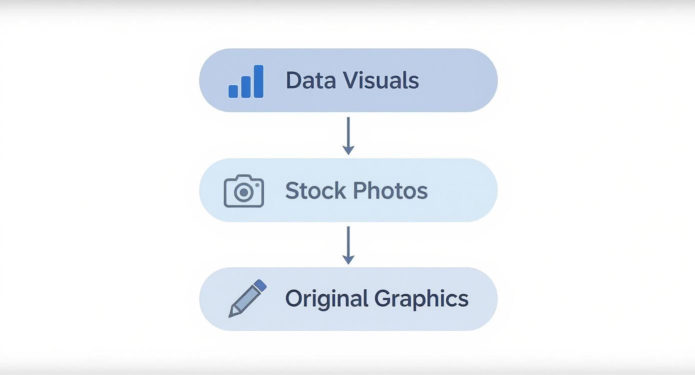
This illustrates that the best strategies use a mix of content types. They use original graphics and data visuals to educate and build authority, and they sprinkle in stock photos to maintain a consistent brand aesthetic.
Using infographics builds instant credibility by backing up your claims with evidence. They're perfect for sharing industry insights, survey results, or historical timelines, immediately positioning your brand as a data-driven authority.
Single-Image Posts: The Powerful Punch
While multi-part visuals are great for deep dives, don't overlook the single-image post. Its power lies in its immediacy. One compelling graphic can deliver a powerful quote, a shocking statistic, or a key takeaway in a single glance.
These posts are perfect for a few specific jobs:
- Announcing something important: A quick, bold graphic cuts through the noise.
- Sharing a testimonial: A quote from a happy customer builds massive trust.
- Posing a question: A thought-provoking question on a simple background can ignite engagement in the comments.
The goal here is to make a strong, immediate impression that stops the scroll and gets people thinking. Each of these formats has a specific job, and a smart visual content for social media strategy uses all of them. The next step is learning how to tailor these formats for the unique environment of each social platform.
Tailoring Your Visuals for Each Social Platform

Creating great visual content for social media isn't a "one-size-fits-all" endeavor. That data-heavy infographic that performed well on LinkedIn will likely be ignored on Instagram. Each platform is its own world with a unique culture, different audience expectations, and an algorithm that plays by its own rules.
Think of it like being a musician. You wouldn't play a heavy metal riff at a jazz club. The core message might be the same, but you have to adapt the delivery, tone, and format to fit the environment. If you don't, your content can seem out of place.
Instagram: The Aesthetic and Educational Hub
Instagram is both a visual showcase and an information library. People expect stunning, high-quality visuals, but they also crave deep educational value. This makes it the ideal platform for multi-slide carousels that break down complex ideas into bite-sized, swipeable lessons.
The "save" feature is a key metric here, as it has turned the platform into a massive hub for evergreen content. Users actively look for posts they can bookmark and return to later, which is why graphical listicles, tip sheets, and detailed tutorials perform so well. To succeed on Instagram, your visuals need to be clean, beautifully branded, and designed to teach something valuable.
And don't forget the details. To ensure your hard work isn't compromised by poor resolution, you must optimize image quality for Instagram. Crisp, high-resolution images are non-negotiable on such a visually competitive feed.
LinkedIn: The Professional Authority Showcase
On LinkedIn, the atmosphere shifts to professional development and industry expertise. The audience here isn't scrolling for creative inspiration—they're looking for thought leadership, hard data, and content that can help them advance in their careers.
This is where data-rich infographics and professional carousels truly shine. An infographic that clearly visualizes a new industry trend will perform far better than a generic stock photo. The goal isn't just to post; it's to build credibility and establish yourself as an authority.
Here’s how to pivot your visuals for a professional crowd:
- Stick to a clean, professional color palette that matches your brand.
- Let data do the talking. Use charts, graphs, and stats to back up every claim.
- Repurpose larger content. Turn key takeaways from reports or articles into multi-slide carousels.
- Prioritize clarity over cleverness. Keep designs simple and straight to the point.
The brands that win on social media don't just post content; they understand the context of the conversation on each platform. Your visuals should feel native, like they were made specifically for that audience.
Facebook: The Community Conversation Starter
Facebook occupies a middle ground between Instagram’s personal feel and LinkedIn’s professional focus. It’s a platform built around community, where the best visuals are those that get people talking.
Polished, educational carousels can still work, but Facebook also responds well to visuals that feel more human and relatable. Consider graphics that ask a direct question, run a simple poll, or feature content from your own community. The algorithm rewards posts that spark genuine comments and shares, so your visuals should serve as an invitation to join a conversation.
The key is balance. You might share a helpful "how-to" listicle one day and a candid behind-the-scenes photo the next. This mix keeps your feed from feeling stale and appeals to the different ways people use the platform. Ultimately, winning with visual content for social media is about being a chameleon—adapting your style to fit in perfectly, wherever you are.
How to Automate Your Visual Content Workflow
Consistently producing high-quality visual content for social media is one of the biggest challenges for any business. For small teams and solo entrepreneurs, the traditional workflow can be overwhelming. It demands significant time, a diverse skill set, and resources that are often unavailable.
This cycle frequently leads to burnout. However, automation offers a solution. It's how you can build a system that finally works for you instead of against you.
The Traditional Workflow: A Recipe for Burnout
Before exploring the solution, let's look at the broken process it replaces. Creating a single high-quality visual post—like an educational carousel—is a surprisingly long and multidisciplinary process for most people.
- Research and Ideation: First, you must decide what to talk about. This involves researching trends, analyzing competitors, and developing a unique angle that your audience will find valuable.
- Copywriting: Next, you have to condense that research into concise text for your graphic. This includes writing headlines, clear explanations, and a call-to-action, all while adhering to character limits.
- Manual Design: This is where many people get stuck. It involves wrestling with design software, selecting brand-approved colors and fonts, finding suitable icons, and meticulously arranging every element on each slide.
- Review and Revise: Finally, the graphic is reviewed to catch typos and fix formatting issues. This back-and-forth process can easily add hours—or even days—to the timeline.
This process requires you to be a researcher, a writer, and a designer simultaneously. Most small businesses don't have a dedicated person for this. The result? Inconsistent posting, generic content, or complete burnout.
The Modern Approach: AI-Powered Automation
Now, imagine a workflow where that entire multi-step process runs itself. That’s what AI-powered automation provides. Instead of manually pushing a project through each stage, an intelligent system does the heavy lifting for you in the background.
This is exactly what an AI agent like Postbae was built for. It's not just a design tool; it’s an AI agent that completely automates the production of professional social media graphics. Users don't even need to provide prompts.
The agent handles the entire pipeline autonomously:
- It generates relevant, authority-building topics for your specific industry.
- It writes educational content that positions you as an expert.
- It automatically designs professional visual posts, including multi-slide carousels, listicles, and infographics, using layouts proven to drive engagement.
This represents a massive shift in content creation. The trend is already moving toward more dynamic visuals, and AI is making it accessible. In fact, 61.5% of marketers are now using AI tools to create visual content more efficiently, allowing them to scale production sustainably.
Automating the most time-consuming parts of creation doesn't just save you time. It frees up your mental energy to focus on what actually matters—like engaging with your community and growing your business.
Regaining Creative Control and Scaling Production
One of the biggest myths about automation is that you have to give up creative control. However, the best tools are designed to be a starting point, not a final answer. With Postbae, every single visual the AI agent generates is fully editable and customizable.
This gives you the best of both worlds. A constant stream of high-quality, industry-specific visual content is created for you, saving you countless hours. But you still retain complete control to tweak the design, refine the copy, or inject your own unique voice. You can even use handy automated background removal tools to quickly adapt visuals without getting bogged down in tedious editing tasks.
This automated workflow makes it possible for anyone—from a solo creator to a busy agency—to produce the kind of authority-building visual content that used to require a full-time designer. To get the full picture, check out our guide on how to automate social media posts.
Measuring the True Impact of Your Visual Content

So you’ve created some great visual content for social media. That's an excellent first step. But if you want to build a strategy that actually grows your brand, you have to know what’s working and what's not.
Measuring your visual performance isn't about vanity. It's about creating a data-driven feedback loop that tells you exactly how to make your next post even better.
Many people focus on vanity metrics like likes and follower counts. While these numbers can be encouraging, they don't tell the whole story. The real impact is hidden in the metrics that signal genuine interest—the ones that show your visuals aren't just being seen, but are actually resonating.
Moving Beyond Surface-Level Metrics
To truly understand performance, you need to focus on metrics that show deeper engagement. These are the numbers that prove your content is valuable, educational, and worth remembering.
Think of it like this: a "like" is a quick head nod. A "save" is someone saying, "This is so good, I need to keep it for later." That's a much bigger win for establishing authority.
Here are the key performance indicators (KPIs) you should be tracking:
- Engagement Rate: This is your total interactions (likes, comments, shares, saves) divided by your followers or reach. It gives you a clear picture of how compelling your content is, regardless of your audience size.
- Saves: On platforms like Instagram, saves are a powerful indicator of value. It means your audience found your visual so useful they bookmarked it.
- Shares: When someone shares your content, they are publicly endorsing your brand. This is how you extend your reach and build significant credibility.
- Click-Through Rate (CTR): If you include a link in a story, bio, or ad, the CTR tells you how many people were motivated enough to click it.
Measuring visual content isn't about counting every interaction. It’s about understanding the quality of those interactions to figure out what your audience truly values.
Translating Data into Actionable Insights
Once you start collecting this data, the real work begins. It's time to turn those numbers into a smarter content strategy. Your analytics provide a direct line to your audience, telling you exactly what they want more of.
This is more important than ever. The global spend on social media ads is projected to exceed $276.7 billion, and by 2030, a staggering 83% of that will be on mobile. This means your mobile-optimized visuals have to perform, or you're just wasting your budget.
Start looking for patterns in your best-performing posts. Ask yourself:
- Which formats get the most saves? Are your long-form carousels being saved more than your quick single-image posts?
- What topics are getting shared the most? Do people want deep industry insights, or are they sharing your practical how-to guides?
- Which designs spark the most comments? Does a bold, minimalist look generate more conversation than a data-heavy infographic?
Answering these questions allows you to stop guessing. If you want to go deeper, our complete guide explains how to measure social media engagement in full detail. By consistently analyzing what works, you can start creating visual content that reliably builds your authority and makes a real impact.
Got Questions About Making Visuals? We've Got Answers.
Jumping into visual content for social media can feel like you’ve been handed a 1,000-piece puzzle with no picture on the box. What formats work? How do you make things look good without a design degree? Let's clear up some of the most common questions.
What's the Best Type of Visual to Build Authority?
If you want to build authority, you have to teach. For that, educational formats are the most effective.
Think multi-slide carousels, detailed infographics, and graphical listicles. These formats allow you to break down complex ideas and share valuable industry knowledge. When you give your audience that "aha!" moment, they don't just like your post—they save it, they share it, and they start to see you as the go-to expert. That’s how you build a loyal following that trusts what you say.
How Can I Make Professional Graphics if I'm Not a Designer?
This used to be a significant barrier, but AI-powered tools have completely changed the landscape. If you feel you lack design skills, platforms like Postbae are an ideal solution. They are built specifically to automate the design work for you.
An AI agent acts as your personal content creator. It handles the research, copywriting, and design for complete visual posts that are ready to publish, all tailored to your industry. You get a steady stream of professional visual content without needing to write a single prompt. And importantly, every generated post is fully editable, so you maintain complete creative control.
How Often Should I Be Posting Visuals?
Forget the idea that you need to post seven days a week. It's all about consistency over frequency.
A good starting point for most is 3-5 times per week on platforms like Instagram and Facebook, and perhaps 2-3 times on LinkedIn. But the real key is that three high-value posts will always outperform seven rushed, mediocre ones. Quality is what stops the scroll. Using an automation tool can help you maintain a consistent schedule without burning out, ensuring every post you publish is genuinely useful.
Can I Just Post the Same Graphic on Every Platform?
You can, but it is not recommended. While your core idea can be repurposed, the actual visual needs to be adapted for each network. A professional, data-heavy carousel performs well on LinkedIn, but that same post would likely underperform on Instagram, where users expect more eye-catching, engaging graphics.
Every platform has its own culture, image dimensions, and audience expectations. True repurposing isn't just copy-pasting; it's about tailoring the design, format, and caption to feel native to that environment. Doing so will significantly improve your engagement.
Ready to stop struggling with design software and start publishing authority-building visuals on autopilot? With Postbae, you get an AI agent that handles the entire creative process for you. See how easy it is to scale your content at https://postbae.com.