A Guide to Social Media Graphics Templates

Discover how social media graphics templates can transform your content strategy. Learn to choose, customize, and automate visuals for every platform.
Think of social media graphics templates like a professional chef's recipe card for your content. Instead of guessing ingredients and cooking times every single time, a template gives you a proven, pre-designed foundation. It’s got all the placeholders ready for your text, images, and logo. This is how brands and creators pump out polished, engaging visuals without burning out.
Understanding the Power of a Visual Blueprint

In a social feed that’s moving a million miles an hour, your graphics are the first (and maybe only) thing people see. A template isn't just a design shortcut; it's a strategic move to build a brand people actually remember. It hands you a layout that’s already been optimized to look good and be easy to read.
Imagine building a house. You wouldn't just start throwing bricks around without a plan, right? A template is that architectural plan for your content. It gives you the structure, making sure every single element is perfectly placed for maximum impact. This lets you focus on what really matters: your message.
Core Components of a Template
At their core, all templates have a few key parts designed for you to easily swap in your own stuff. Once you get these, you’ll see how a simple framework can be flipped into a unique piece of content that’s 100% yours.
- Placeholders: These are the empty boxes waiting for your content. Think text boxes for headlines or frames for your images and videos. Just drag and drop.
- Layout Structure: This is how all the text, images, and shapes are arranged. A solid layout guides the viewer's eye exactly where you want it to go, without them even realizing it.
- Brand Elements: Good templates have dedicated spots for your logo, brand colors, and specific fonts, making it dead simple to keep your look consistent.
This modular setup empowers anyone—even if you think you have zero design skill—to create high-quality graphics in minutes. For a deeper dive into making your posts pop, check out our guide on creating powerful visual content for social media.
A well-chosen template does way more than save time. It enforces brand consistency, which can boost revenue by up to 33%. When your audience instantly recognizes your posts from across the room, you build trust. You build authority.
Why Templates are Essential for Modern Marketing
The content beast is always hungry. Small business owners, marketers, and creators are all under constant pressure to post killer visuals just to stay in the game. Templates are the answer. They slash your production time. Instead of staring at a blank screen for hours, you can knock out a pro-level graphic in minutes.
This kind of speed is essential for keeping a consistent posting schedule, which the algorithms on platforms like Instagram and Facebook absolutely love. By making the design part easy, templates free you up to work on strategy, engage with your community, and actually grow your business. All while your visual game stays on point.
Picking the Right Template for Each Social Platform
Ever seen a beautiful, tall graphic made for an Instagram Story get squished into a horizontal LinkedIn post? It’s awkward. It looks broken. And it screams, “I don’t know what I’m doing.”
Here’s the deal: every social platform has its own language. Its own vibe. Using the right template isn't just about looking good; it's about speaking that native language so people actually listen. A template built for a specific network makes sure your message lands right, preventing that cringey, out-of-place feeling and boosting your performance.
Mastering Instagram with Visual Storytelling Templates
Instagram is all about the visuals. Full stop. Your goal is to stop the scroll, and you do that with killer aesthetics and a good story. Templates here need to be bold, clean, and designed for someone staring at their phone.
One of the most powerful tools in your Instagram arsenal? Multi-slide carousels. They let you break down big ideas into bite-sized, swipeable pieces. Perfect for tutorials, step-by-step guides, or showing off different features of a product.
- Carousel Templates: You need a design with a killer first slide that grabs attention and a final slide with a clear call-to-action. Consistency across all slides is key to making it feel smooth. For a deep dive, check out our guide on how to create Instagram carousels that people actually swipe through.
- Story Templates: These have to be vertical, full-screen (1080x1920 pixels). No exceptions. Templates with spots for interactive stickers like polls or Q&As always perform better.
- Single Post Templates: Great for quick announcements, a powerful quote, or a single, mind-blowing statistic. The best ones have a clear focal point and don't cram in too much text.
Building Authority with Professional LinkedIn Graphics
LinkedIn is the office of the internet. It's for professional networking, industry deep dives, and B2B marketing. The vibe here is more buttoned-up and data-driven. Your templates should scream credibility and expertise.
Cluttered, colorful, or overly casual designs will just get you ignored. Think clean layouts, your company’s color palette, and professional fonts that are easy to read. The whole point is to present information clearly and without fluff.
On LinkedIn, a graphic's job is to add value and prove you know your stuff. Templates that visualize data, share a key industry stat, or summarize a report are ridiculously effective for building authority.
Here’s what works on LinkedIn:
- Infographic Snippets: Take one killer chart or statistic from a bigger report and turn it into a graphic. It’s a perfect teaser to drive traffic.
- Quote Graphics: Feature an insight from a big name in your industry or even your own CEO. It’s a simple way to position your brand as a thought leader.
- Event Announcements: Clean, professional templates for webinars or conferences that clearly state the topic, date, speakers, and how to sign up.
Driving Action with Facebook Templates
Facebook is the versatile workhorse. It hits a massive audience, making it perfect for building a community and driving traffic to your website. Graphics here need to be clear, straight to the point, and almost always have a call-to-action (CTA).
Since the Facebook algorithm loves content that gets people talking, templates designed to ask questions, bust myths, or share quick tips are gold. You want to create visuals that are easy to understand and even easier to share.
To make this super simple, here’s a quick-reference guide to help you choose the right template every time.
Platform-Specific Template Guide
| Platform | Popular Template Types | Best For | Key Design Tip |
|---|---|---|---|
| Carousels, Stories, Quote Cards | Educational content, storytelling, brand building | Use bold visuals and ensure mobile-first readability. | |
| Data Visualizations, Infographics, Event Banners | Industry insights, B2B marketing, thought leadership | Maintain a clean, professional aesthetic with clear typography. | |
| Listicles, Tip Graphics, Question Prompts | Community engagement, driving traffic, announcements | Include a clear and direct call-to-action. |
Seriously, tailoring your social media graphics templates to the platform you’re posting on is a huge advantage. It’s the difference between blending in and standing out, ensuring your visuals don’t just look pretty but actually work to hit your goals.
How to Customize Templates for a Unique Brand Identity
A great social media graphics template isn’t the finish line—it’s the starting block. Just dropping your text into a placeholder and calling it a day won't build a brand people remember. The real magic happens when you customize it, transforming a generic layout into something that’s unmistakably yours.
This whole process is way more than just filling in the blanks. It's about injecting your brand’s personality into every pixel, making sure every graphic you post is a consistent, authentic piece of your business. When you get this right, your audience won't even know you started with a template; they'll just see killer, on-brand content.
Establish Your Visual Foundation with Brand Guidelines
Before you even think about touching a template, you need a clear set of brand guidelines. This is your visual rulebook. It’s what ensures every single piece of content looks and feels like it came from the same place. Consistency builds recognition, and recognition builds trust. Simple as that.
Your core visual elements should include:
- Color Palette: Don't just pick colors you like. Choose a primary, secondary, and accent color that actually reflect your brand's vibe. Use these religiously across all your social media graphics templates.
- Typography: Pick one or two primary fonts—one for headlines, another for body text. Readability is everything, especially on mobile, so make sure your fonts are crystal clear.
- Logo Placement: Decide on a consistent spot for your logo. Whether it's the top-left or bottom-right corner, stick with it so your audience’s eyes are trained to find it.
When your branding is consistent, your audience can recognize your content in a split second, even without seeing your name. That immediate recognition is a massive advantage in a fast-scrolling social media feed.
This diagram shows how different platforms require unique templates, but they should all feel like they're part of the same family.
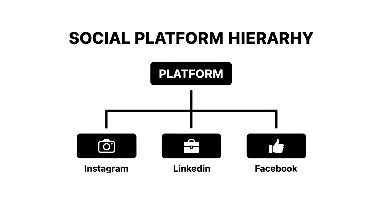
The key takeaway here is that while the format changes (an Instagram carousel is different from a LinkedIn post), the core branding—colors, fonts, logo—has to stay the same to build a strong, cohesive presence.
Infuse Personality with Content and Imagery
Okay, with your visual foundation locked in, it's time to ditch the placeholder content and swap in original material that speaks in your unique voice. This is where you really make the template your own and give your audience something of actual value.
Getting rid of that generic filler content is non-negotiable. Research shows that 73% of consumers are more likely to buy something after seeing a video or image that explains it. This just goes to show how powerful authentic visuals are for connecting with people.
Here are a few practices to follow:
- Use High-Quality, Original Images: Ditch the generic stock photos whenever you can. Use professional shots of your products, your team, or even your customers. Real imagery builds a much stronger connection and instantly separates you from competitors who are all using the same tired stock pictures.
- Write Compelling, On-Brand Copy: Your words are just as important as your visuals. Make sure the text matches your brand’s tone—whether that's professional, witty, or inspirational. Write clear, concise copy that gets straight to the point and offers real value.
- Maintain Visual Hierarchy: A good template already has a strong visual hierarchy built-in, but as you add your own content, you have to protect it. The most important thing (like a headline or a key number) should be the most prominent. Use size, color, and placement to guide the viewer's eye through the graphic in a logical way.
Streamlining Your Workflow with Automated Content Creation
Customizing templates is a huge leap from staring at a blank page. But what if you could ditch almost all the manual design work? The next real evolution in making content isn't just about filling in blanks in a template anymore. It’s about using AI-driven systems that create professional social media graphics for you, on their own.
This is the difference between being a designer and directing one. Instead of sinking hours into picking layouts, writing copy, and nudging elements into place, you can hand off the entire production line to an intelligent agent. This frees you up for the stuff that actually moves the needle—strategy, talking to your community, and growing your business.
From Manual Design to Autonomous Creation
Think about the old way: you hunt for a template, research a topic, write copy for five carousel slides, find some icons, and then meticulously arrange everything to look on-brand. An automated system does all of that at once.
An AI agent can research industry trends, generate educational content, select a proven template, and populate it with on-brand visuals—all without requiring a single user prompt. This turns a multi-hour creative process into a simple review-and-approve workflow.
This hands-off approach is a powerful advantage, especially for creating the kind of authority-building content that is notoriously time-consuming. Putting together a solid infographic or a multi-slide educational post usually requires a researcher, a writer, and a designer. Automation collapses all those roles into one seamless operation.
A Look at AI-Powered Visual Production
Platforms like Postbae are leading this charge. Think of Postbae as an AI content agent working quietly in the background, autonomously whipping up complete visual posts designed for your specific industry. It specializes in cranking out the educational content that makes you look like you know your stuff.
Here’s the breakdown:
- It creates complete visual graphics, not just text captions. We're talking multi-slide carousels, listicles, and infographics.
- It operates without prompts, researching topics and generating content completely on its own.
- It matches content with proven layouts, so every graphic is professionally designed and built to get engagement.
The whole point is to give you a steady stream of high-quality, ready-to-post visuals. And if you’re concerned about control, every graphic it generates is 100% editable and customizable, so you always have the final say. To see this in action, check out our guide on creating automated social media posts.
Why Automation Is Essential in a Crowded Market
The world of social media advertising is getting wild, with global spending projected to hit a mind-boggling $276.7 billion. This flood of cash is exactly why social media graphics templates have become a lifeline for small businesses trying to get noticed. Every platform demands visuals that stop the scroll, and with LinkedIn hitting a 6.50% engagement rate, polished graphics are no longer optional.
For founders and social media managers, tools that automate design save an insane amount of time, letting small teams punch way above their weight class and compete with massive budgets. To get ahead of the curve, it's also worth learning about creating captivating AI video for social media, which can perfectly complement your graphics strategy and seriously expand your reach on platforms like TikTok and Reels.
An Essential Checklist for Effective Social Media Graphics
Before you hit "publish" on that graphic, hold up. A quick quality check is the difference between content that pops and content that flops.
Think of this checklist as your final once-over to make sure every visual you post is polished, on-brand, and actually works. This isn't just about looking good; it's about getting results.

Running every graphic through these points builds the habit of excellence. It’s your last line of defense against the small mistakes that can make your brand look amateur and dilute your message.
Brand Consistency and Identity
First up, does this graphic look like it came from your brand? Consistency is what builds that instant recognition and trust over time. If it looks random, it gets ignored.
- Logo Visibility: Is your logo there? Is it the right size and in the right spot? It needs to be clear but not screaming for attention.
- Color Palette: Are you strictly using your approved brand colors? Throwing in random colors is a fast way to confuse your audience about who you are.
- Typography: Are the fonts correct? Your headlines and body text should use the same fonts as all your other marketing stuff. No exceptions.
Core Design and Composition Principles
Next, step back and look at the overall design. In a feed that moves at lightning speed, a well-composed graphic has to grab the eye and make its point in about two seconds flat.
A strong visual hierarchy is everything. It tells the viewer's brain what to look at first, second, and third. You only have a few seconds—make them count.
- Visual Hierarchy: Is the most important thing—the headline, the discount, the key number—the most prominent element? Use size, color, and placement to create a can't-miss focal point.
- White Space: Is there enough breathing room? A cluttered design is an instant turn-off. It’s overwhelming and makes people scroll right past.
- Image Quality: Are your images and icons sharp? Blurry, pixelated visuals make your brand look cheap and unprofessional. Instantly.
And remember, your graphics aren't just pretty pictures; they're a core part of your marketing. To make sure they're pulling their weight, it helps to understand how to create a robust content strategy.
Readability and Accessibility
Finally, can everyone understand your graphic easily? Accessibility isn't just a nice-to-have; it's a must for effective communication. If people can't read it, it failed.
- Text Readability: Is the text big enough to read on a tiny phone screen without squinting?
- Color Contrast: Is there enough contrast between your text and the background? If you're not sure, use a contrast checker tool. It takes five seconds.
- Alt Text Ready: Did you write a simple, descriptive alt text for the image? This is non-negotiable for visually impaired users who rely on screen readers.
- Concise Copy: Is the message simple and direct? Ditch the jargon and long sentences. Your graphic should get its core idea across almost instantly.
Got Questions About Graphics Templates?
Jumping into the world of social media graphics templates is a powerful move, but it usually sparks a few questions. Can you actually stand out? What's the deal with different platforms? I get it. Getting straight answers is the key to actually making templates work for you. Let's tackle the big ones so you can move forward with confidence.
Can I Actually Create Unique Content Using Templates?
Yes, 100%. The template is just the skeleton. Your content, your branding, and your images are what give it a soul. Think of a template as a professionally designed framework, not a finished product.
Once you apply your brand colors, fonts, logo, and—most importantly—your actual words on it, that generic layout becomes something that is unmistakably yours. The most unique part of any graphic, though, is your message. Your insights, your data, your perspective. A good social media graphics template is built for this kind of flexibility, letting you bend it to fit your story perfectly.
The real power of a template isn't just its design, but its ability to amplify your brand's voice. Your unique content is what turns a good layout into a memorable piece of marketing that connects with your audience.
At the end of the day, a template is just the starting line. The final graphic is all you. It’s the layers of branding and original thought you add that make sure the end result screams your brand, not the template's.
Do I Really Need a Different Template for Every Platform?
For the best results? Absolutely. Using templates designed specifically for each platform’s unique dimensions and user habits is critical. A vertical Instagram Story template (1080x1920 pixels) just isn’t going to work as a horizontal LinkedIn post (1200x627 pixels). It’ll look broken.
But it’s more than just avoiding awkward cropping and making sure your graphics look sharp. Platform-specific templates are usually designed with how people behave on that platform in mind.
- Instagram Carousels: These templates are literally built to make people swipe, telling a story one slide at a time.
- LinkedIn Posts: The layouts are often cleaner and more data-heavy, made for a professional crowd that’s there for industry insights.
- Facebook Graphics: These visuals are usually optimized for a clear call-to-action to get people talking or clicking over to your website.
Using the right template for the right platform isn't just about pixels; it shows a level of polish and understanding that builds your credibility with the audience on each channel.
How Can I Make My Graphics More Accessible?
Making your graphics accessible means everyone, including people with visual impairments, can understand your message. It’s not just a "nice-to-have"; it’s a core part of effective, inclusive design.
When you’re customizing your templates, just focus on a few key things.
- Crank Up the Contrast: Use high contrast between your text and background colors. This is probably the most important thing for readability, especially for users with low vision.
- Pick Legible Fonts: Go for clear, simple fonts over fancy script fonts for the important stuff. Make sure the font is big enough to be read easily on a tiny phone screen.
- Use Alt Text: Always. Every platform has an alternative text (alt text) feature. Write a quick, descriptive sentence that explains what’s in the graphic for people using screen readers.
Keeping your copy simple and easy to understand also helps make your design more accessible—and frankly, more effective—for absolutely everyone.
What’s the Difference Between a Manual Tool and an Automated One?
The real difference is in the workflow and how much heavy lifting you have to do. Both can get you professional graphics, but they come at the problem from completely opposite directions.
A manual design tool gives you a library of templates and a drag-and-drop editor. With this model, you’re the creative director, the copywriter, and the designer. You are responsible for:
- Picking the right template.
- Researching a topic and writing all the content.
- Finding the right images or icons.
- Arranging every single element to fit your brand.
This gives you total creative control from the jump, but it’s a time-suck that requires you to be good at design, writing, and research.
On the flip side, an automated AI agent like Postbae does the whole creation process for you. It works on its own to do the tasks that would normally take a whole content team.
- It researches topics in your industry.
- It writes killer copy for multi-slide posts.
- It generates the complete visual graphic, like a full carousel or infographic.
You still have the final say and can edit anything you want, but the first 95% of the work is already done. This turns a long, multi-skilled task into a quick review process, saving you an insane amount of time.
Ready to stop designing and start directing? Postbae is the AI agent that autonomously creates professional, authority-building social media graphics for your business. Get high-quality carousels, infographics, and more without ever writing a prompt. Automate your social media at https://postbae.com.