How to Create a LinkedIn Carousel Post That Gets Noticed

Discover how to create a high-performing LinkedIn carousel post. This guide offers actionable steps for design, content, and strategy to boost engagement.
Ever seen a post on LinkedIn that makes you stop dead in your scroll and start swiping? Chances are, it was a carousel.
Think of it as a mini-presentation baked right into a single post. Instead of a static image or a wall of text, you get a swipeable document that lets you walk people through step-by-step guides, drop some industry knowledge, or tell a visual story. It's interactive, it's clean, and it works.
Why LinkedIn Carousel Posts Are So Effective
A single image gets a glance. A block of text gets scrolled past. But a LinkedIn carousel post? It makes people pause. That little "swipe to see more" cue is almost irresistible.
This isn't just about grabbing attention; it's about working with the algorithm. Carousels directly increase the one metric the LinkedIn algorithm prioritizes: dwell time.
When someone stops to swipe through your slides, they're spending more time on your post. That extended interaction sends a massive signal to the algorithm that your content is valuable. The reward? LinkedIn pushes your post into more feeds, giving you a reach that text or single-image posts can only dream of.
The Power of Interactive Storytelling
Beyond just appeasing the algorithm, carousels are brilliant for breaking down complex ideas. Instead of dumping a novel into the caption, you can guide your audience through a story, one slide at a time.
This makes your content:
- Way More Digestible: Trying to explain a new marketing funnel or a complex data trend? Spreading it across a few clean slides makes it infinitely easier to follow than a dense paragraph.
- Seriously Engaging: The simple act of swiping keeps people invested. It’s a small action, but it creates a feedback loop that makes them want to see what’s on the next slide, and the next.
- Perfect for Any Goal: Whether you're teaching a skill, showing off a case study, or sharing key stats from a report, the format is incredibly versatile.
The magic of a carousel is that it turns passive scrolling into active participation. Every swipe is a tiny commitment from your reader, pulling them deeper into your message.
Unmatched Engagement Rates
The data doesn't lie. Carousels consistently outperform other post formats on LinkedIn.
An extensive analysis of 1 million posts by Buffer found that carousels get 278% more engagement than videos, 303% more than images, and an impressive 596% more than text-only posts.
You can dig into the full research on LinkedIn engagement trends, but the takeaway is clear. This isn't a small bump—it's a significant advantage for anyone serious about building authority on the platform.
Structuring Your Carousel for Maximum Impact
An effective LinkedIn carousel isn’t just a random slide deck. It's a micro-presentation with a clear beginning, middle, and end. Think of it less like a photo album and more like a short, punchy story.
The entire process hinges on one question: What is the single goal of this post?
Are you trying to break down a complex topic? Show off a case study? Walk someone through a tutorial? Nailing this down first is everything. It dictates every slide that follows. Without a clear goal, your carousel is just noise, and people will swipe right past it.
Once you know your goal, you can map out the flow. The best carousels follow a simple, powerful three-act structure.
The Three-Act Structure of a Carousel
This framework is your best friend for creating content that’s logical, hooks people in, and actually gets them to do something.
The Hook (Slide 1): Your first slide has one job: stop the scroll. It needs a magnetic title, a question that makes people think, or a bold statement that creates an "information gap." You want to spark curiosity and give them a compelling reason to swipe. A title like "The 5 Biggest Mistakes in Content Marketing" is much more effective than a generic one like "Content Marketing Tips."
The Value (Middle Slides): This is where you deliver on the promise you made in the hook. It's the core of your carousel. Each slide should build on the last, delivering valuable insights or actionable steps. Break down your big ideas into one digestible point per slide. Mix up text, data, and simple graphics to keep it visually interesting. For a deeper dive on crafting that flow, some find guides on carousel ad design for effective storytelling useful.
The Call-to-Action (Final Slide): Never leave your audience hanging. This is your opportunity to tell them what to do next. Your Call-to-Action (CTA) needs to be direct, crystal clear, and tie back to the original goal of your post.
Crafting a Compelling Narrative
Let's make this real. Imagine you're a marketing consultant making a 7-slide carousel about boosting email open rates.
Slide 1 (The Hook): "Are Your Emails Being Ignored? 90% of outreach emails are never opened. Here's how to fix it." This hits a pain point and promises a solution. Done.
Slides 2-5 (The Value): Each slide hammers home a single, actionable tip. Slide 2 could be "Tip 1: Personalize the Subject Line," with a quick 'why' and a solid example. Slide 3 covers "Tip 2: Optimize Your Preview Text," and so on. Easy to follow, easy to implement.
Slide 6 (The Summary): A quick recap slide is a powerful move. "Recap: To boost open rates: 1. Personalize, 2. Optimize, 3. Segment, 4. Test." It helps the information stick.
Slide 7 (The CTA): "Want more data-driven marketing tips? Follow me for weekly insights." Simple. Relevant. It encourages a long-term connection, not just a one-off view.
When you structure your content like a journey, you're not just throwing information at people. You're guiding them from a problem to a solution, and that's how you build authority and create something they'll actually remember.
Nail the Design: The Anatomy of a High-Performing Carousel
Okay, so you've got an idea for an engaging LinkedIn carousel. But an idea is just the start. The real magic—the thing that earns the swipe—is in the execution. Let's break down the design details that separate a polished, professional carousel from one that gets scrolled past without a second thought.
First up, the technical stuff you can't ignore. Get this right from the beginning and you'll save yourself a ton of headaches.
- Square: The classic 1080 x 1080 pixels is your safest bet. It's clean, balanced, and always looks good in the feed.
- Vertical: If you want to grab more attention, go with 1080 x 1350 pixels. It takes up more screen real estate, which is a massive advantage on mobile.
Here's the most important part: you aren't uploading a bunch of separate images. You need to combine all your slides into a single PDF document. This is the secret that activates LinkedIn's swipeable document viewer, creating that smooth carousel experience everyone loves.
Think of your carousel's flow in three simple parts.
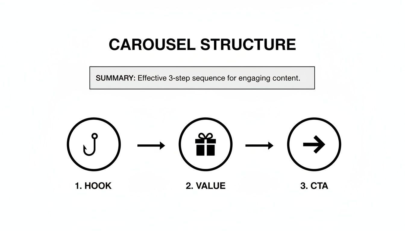
This little diagram is basically the blueprint: grab their attention with a killer hook, deliver genuine value, and then tell them exactly what to do next with a clear call to action.
Keep it Clean and On-Brand
Your carousel is a direct reflection of your brand. Every slide should feel like it came from you. That means sticking to your brand's color palette, using your logo consistently, and choosing the right fonts. If you don't have official brand guidelines, just create a simple style guide for your carousels and stick to it. Consistency builds trust.
Readability is everything. Your message is worthless if people have to squint to read it. Stick to clean, professional sans-serif fonts—think Lato, Open Sans, or Roboto. They're designed for screens. Pair them with a high-contrast color scheme, like dark text on a light background. Please, don't cram your slides with text. Use plenty of white space to let your key points breathe and guide the reader’s eye. While this is crucial for LinkedIn, the same design fundamentals apply elsewhere, as we cover in our guide on how to create Instagram carousels.
A well-designed carousel doesn't just share information; it creates an experience. Generous white space isn't empty space—it's a tool to reduce cognitive load and make your content feel more premium and approachable.
So, How Are You Actually Going to Make This Thing?
The tool you choose will have a big impact on your time, cost, and the final look of your carousel. You've got a few paths you can take, and each has its pros and cons.
Comparing Carousel Creation Methods
Deciding how to produce your carousels is a strategic choice. Are you trading time for money, or vice versa? Here’s a quick breakdown of the most common approaches to help you figure out what makes sense for you.
| Method | Time Investment | Design Skill Required | Typical Cost | Key Benefit |
|---|---|---|---|---|
| Manual Design Tools | High (2-5 hours/carousel) | High | Low ($0-$50/mo) | Total creative control |
| Hiring a Freelancer | Medium (briefing & review) | None | High ($50-$300+/carousel) | Professional, custom results |
| Postbae AI Agent | Low (minutes/carousel) | None | Low (subscription) | Speed, scale, and quality |
Ultimately, the right method depends on your budget, your schedule, and whether you're making one carousel a month or several a week.
Manual design tools give you complete creative freedom, but they come with a steep learning curve if you're not a designer. You're in charge of everything from the layout to the font pairings, which can eat up a ton of time.
Hiring a freelancer is a great option if you have the budget. You are almost guaranteed a professional result, but it costs more and requires you to manage the project and communicate your vision clearly. It's perfect for a big campaign, but probably not sustainable for daily posting.
Then you have an AI-powered agent like Postbae. It completely automates the production of visual social media posts for you—from concept to the final, polished graphic. It generates carousels tailored to your industry without you having to write a single prompt. This approach saves you a massive amount of time while still delivering professional-quality designs, and you always have the final say with full editing control.
Publishing and Optimizing Your LinkedIn Post
Nailing the design of your carousel is a huge win, but it's only half the battle. How you actually publish and frame it on LinkedIn is what separates a post that gets a few polite likes from one that actually starts conversations and drives results.
The secret? Uploading it as a PDF document. Forget just dropping the images into a post. When you create a new post, look for the "Add a document" option (it’s the little page icon) and upload your final PDF. This is the magic step that turns your file into that slick, swipeable carousel experience. LinkedIn's algorithm loves this format because it keeps people on your post for way longer—a key signal that your content is valuable.
Writing a Caption That Actually Adds Value
Your caption is the opening act for your carousel. It shouldn't just be a lazy summary of what's inside; it needs to add context, spark curiosity, and give people a reason to start swiping.
Think of it as the trailer to your movie. An effective caption usually has:
- A hook that grabs them instantly: Kick it off with a provocative question or a bold statement that cuts right to the heart of your topic.
- The "why you should care" context: Briefly explain what the carousel covers and what’s in it for them.
- A touch of you: A quick personal story or a genuine insight makes it feel less like marketing and more like a real conversation.
The goal is to tease the value without giving away the entire story. If you want to go deeper on this, we have a whole guide on how to write engaging LinkedIn posts that you’ll find super helpful.
Hashtags and CTAs: Your Secret Weapons
Hashtags are your post's GPS, helping it find the right audience. Don't just spam a bunch of random tags. A strategic mix of broad and niche hashtags is way more effective. It is generally best to aim for 3-5 super-relevant ones.
For instance, if your carousel is about project management, you might use:
#ProjectManagement(The big, popular one)#ProductivityTips(A related, high-interest tag)#AgileMethodology(The niche one that attracts experts)
And finally, never post without a clear Call-to-Action (CTA). Your last slide needs to tell people exactly what you want them to do next, and you should echo that CTA in your caption so they can't possibly miss it.
A great CTA is simple and direct. Instead of a weak "Let me know your thoughts," try something specific that's easy to answer, like, "What's one tip you would add? Drop it in the comments!"
This isn't just theory; the data backs it up. According to research from Social Insider, carousels and multi-image posts on LinkedIn see an average engagement rate of 6.6% by impressions. That blows past videos (5.6%) and single images (4.85%).
Those numbers don't lie. The interactive, swipe-friendly nature of a well-executed carousel is one of the most powerful tools you have to stop the scroll on LinkedIn.
Want to Automate Your Visual Content? Here's How.
For most small businesses and marketing agencies, pumping out high-quality visual content feels like a full-time job. It’s a constant battle against the clock that involves research, writing, and hours staring at a design tool. This is where automation stops being a buzzword and starts giving you your time back.
Imagine a system that just handles the entire creative workflow for you. That’s the whole idea behind AI agents like Postbae. It’s built to take the entire process of making professional graphics—especially the slick, multi-slide LinkedIn carousel post format—off your plate.

This Isn’t Just Another Design Tool
Unlike the usual design software that gives you a blank canvas and says, "Good luck," an autonomous AI agent does the work in the background. You don't have to write a single prompt. It’s handling everything from brainstorming and research to writing the copy and designing the final graphics.
This is a powerful advantage for authority-building content. Postbae’s AI is specifically trained to create industry-specific posts that educate your audience, such as:
- Educational carousels that break down complicated topics into simple slides.
- Engaging listicles packed with tips your audience will actually use.
- Clean infographics that share interesting industry stats and facts.
The system is smart enough to pick the right content format, match it to a proven template, and fill it with information that’s actually relevant to your business. The final visual posts are generated automatically, ready for you to review. And if you need custom images to spice things up, you can always check out different AI image generators for social media to create unique assets.
But You Still Have Full Creative Control
"Automation" doesn't mean you give up your brand's voice or look. While Postbae does all the heavy lifting, you're always the one with the final say.
The real win here is efficiency without compromise. You get a steady stream of professionally designed content, but you never lose the power to make it perfectly you.
Every single visual post the AI generates is fully editable. You can tweak the text, swap out an image, or change the colors to make sure every carousel is 100% on-brand and hits your campaign goals. It's a mix of autonomous creation and manual control that makes sense for scaling your content.
This approach turns content creation from a daily grind into a simple "review and approve" task. It gives smaller businesses the firepower to maintain a polished, authoritative presence on LinkedIn—letting you compete with the big guys without needing a huge design team or spending your life inside a design tool.
Hitting "publish" on your LinkedIn carousel isn't the finish line. It's just the starting gun.
Now the real work begins: figuring out what actually worked and what didn't. This is where you stop guessing and start building a content strategy that actually gets results.
LinkedIn gives you the basic scorecard: impressions, clicks, comments, and shares. At a glance, these numbers tell you if your post made a splash or just sank. For instance, tons of impressions but hardly any clicks? That’s a huge red flag that your cover slide didn't do its job. It failed to hook anyone.
The Metrics That Actually Matter
Tracking performance is way more than just chasing vanity metrics. You need to dig into the data that tells you what your audience is doing and whether your content is any good.
- Impressions: Simple enough. This is how many times your carousel showed up in someone's feed. Think of it as your total potential audience.
- Click-Through Rate (CTR): This is the percentage of people who saw your post and actually clicked to see more. It's a direct measure of how effective your hook and cover slide were.
- Engagement Rate: The big one. This blends likes, comments, shares, and clicks, then divides it by impressions. It's the ultimate health score for your post.
- Slide-by-Slide Views: Now this is the goldmine. LinkedIn literally shows you how many people viewed each slide, revealing the exact moment your audience got bored and bailed.
See a massive drop-off after slide three? That’s your audience indicating that your content got less engaging at that point. On the flip side, if most people make it to the end, you nailed the storytelling.
Every post is an experiment. Your analytics aren't just numbers on a screen; they are direct, unfiltered feedback from your audience telling you exactly what they want more of.
This kind of slide-by-slide insight is priceless and confirms why carousels are so effective. LinkedIn’s own data shows that turning a static PDF into an interactive journey just plain works better for engagement. If you want to geek out on the numbers, Buffer’s analysis of LinkedIn stats is a great place to start.
Start looking at this data regularly, and you'll spot patterns. Maybe carousels packed with charts and graphs kill it for your audience. Or perhaps a certain type of call-to-action always gets more comments.
Use these clues to make your next LinkedIn carousel post even sharper. Each one should be an improvement on the last.
Creating high-quality carousels over and over again is a massive time sink. Postbae handles the entire process for you, automatically generating professional, industry-specific visual posts like carousels without you ever touching a design tool or writing a prompt. Get your time back and level up your content at https://postbae.com.