The Ultimate Guide to Image Size for LinkedIn Posts

Master the ideal image size for LinkedIn posts. Our guide covers dimensions for feed images, carousels, and banners to boost engagement and visibility.
When it comes to your LinkedIn posts, getting the image size right is the difference between looking sharp and getting awkwardly cropped. For the best results, stick to 1200 x 627 pixels for any shared links or standard landscape images. If you're going with a square look, 1080 x 1080 pixels is your go-to.
Using these specific dimensions is a simple trick to make sure your visuals look crisp and professional on both desktop and mobile feeds. No more important details getting cut off.
Your Quick Reference for LinkedIn Image Dimensions
Visuals are a critical part of your professional presence on LinkedIn. A sloppy, pixelated, or poorly cropped image can hurt your credibility before anyone even reads your post. The platform has its own set of rules for different post types, and knowing them is key to making a strong first impression.
Whether you're posting a single image, a carousel, or a link preview, there’s an optimal size that will help you stand out in a sea of updates. This guide is your cheat sheet to get it right every single time.
Here's a quick visual breakdown of the most common image sizes you'll need.
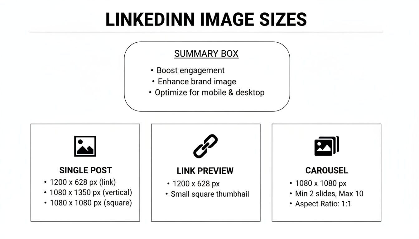
As you can see, it all comes down to the aspect ratio. You're looking at a 1.91:1 ratio for links and landscape photos, and a clean 1:1 ratio for square posts and carousel cards. For a complete deep-dive on every single image spec across the platform, this LinkedIn Image Size Guide is an awesome resource.
Sticking to these specs is the first step. It moves you from guessing games to intentionally designing visuals that grab attention and get your message across perfectly.
LinkedIn Image Size Quick Reference Chart
To make things even easier, here’s a quick-reference table with all the essential numbers in one place. Bookmark this page so you never have to guess again.
| Post Type | Recommended Dimensions (Pixels) | Aspect Ratio | Max File Size |
|---|---|---|---|
| Single Image Post (Square) | 1080 x 1080 | 1:1 | 5 MB |
| Single Image Post (Landscape) | 1200 x 627 | 1.91:1 | 5 MB |
| Link Preview Image | 1200 x 627 | 1.91:1 | 5 MB |
| Carousel Post Card | 1080 x 1080 | 1:1 | 10 MB |
| Company Page Banner | 1128 x 191 | 5.9:1 | 4 MB |
| Profile Picture | 400 x 400 | 1:1 | 8 MB |
| Profile Header | 1584 x 396 | 4:1 | 8 MB |
Getting these numbers right ensures your profile and posts look polished and professional, which is exactly what you want on LinkedIn. Think of it as the digital equivalent of showing up to a meeting in a well-fitted suit versus a wrinkled shirt.
Why Bothering With LinkedIn Image Sizes Actually Matters
It can feel like a chore to manage image dimensions, just another box to check before you can hit "post." But getting your LinkedIn image sizes right isn't just about following the rules—it's about making your content work for you.
Think of it this way: your visuals are the first handshake you make in a crowded professional feed. A crisp, perfectly framed image says "I'm competent and I pay attention to detail." An awkwardly cropped, pixelated mess? It undermines your entire message before anyone even reads the first word.
Better Engagement, Better Reach
The LinkedIn algorithm is a complex system, but it consistently rewards content that gives users a good experience. High-quality, properly sized images are a huge part of that. They stop the scroll and make your posts visually appealing.
It's a simple feedback loop: better images lead to more engagement (likes, comments, shares). More engagement signals to the algorithm that your post is valuable. The algorithm then shows it to more people. It's a small detail that can directly boost your organic reach, getting your message in front of a much larger, more relevant audience.
For example, a sharp 1080x1080 pixel square image is perfect for grabbing attention and showcasing a single, powerful visual. On the other hand, a wider 1200x627 pixel landscape image gives you the real estate to display data, a team photo, or a panoramic shot without compromise.
Avoid That Awkward, Unprofessional Crop
This is probably the biggest win. Ever upload an image that looked perfect on your desktop, only to see the most important part chopped off on mobile? We've all been there. It’s frustrating and it looks sloppy.
Sticking to LinkedIn’s recommended dimensions ensures your content looks consistently professional, no matter what device your audience is using. It’s about controlling your brand's presentation. When you pair a killer visual with a compelling caption, you're unstoppable. For more on that, check out our guide on how to write engaging LinkedIn posts.
Mastering Single Image Posts for Maximum Impact
Single image posts are the bread and butter of a solid LinkedIn visual strategy. They’re versatile, direct, and incredibly effective for getting a single, powerful message across. But to really make them work, you need to understand the three main formats LinkedIn plays with and pick the right one for your goal.
Each format—square, landscape, and portrait—has its sweet spot and recommended dimensions. Nailing these details is the difference between your visuals looking crisp and professional versus getting awkwardly cropped in the feed.
The Three Core Formats Explained
Let’s get into the specifics of each image type so you can decide which one fits your content best.
Square Images (1:1 Aspect Ratio): This is your all-rounder, the most versatile format of the bunch. Stick to a recommended size of 1080 x 1080 pixels, and your image will look balanced and clean on both desktop and mobile. It’s perfect for headshots, product close-ups, or any graphic with centered text.
Portrait Images (4:5 Aspect Ratio): If you want to own the mobile feed, portrait is your go-to. Sized at 1080 x 1350 pixels, these taller images grab more vertical screen real estate on smartphones, which can make users pause their scroll just a little longer. This format is a killer for infographics, detailed visuals, or any graphic where you want to command extra attention.
Landscape Images (1.91:1 Aspect Ratio): The classic landscape format is built for wide shots, group photos, or event banners. The ideal size here is 1200 x 627 pixels. This is also the exact dimension LinkedIn pulls for link preview images, so it's a familiar and reliable choice that people are used to seeing.
LinkedIn has tweaked these recommendations over the years to keep the user experience smooth. As remote work became the standard, the platform really locked in its image size guidelines to make sure visuals were clear no matter the device. While your photos need to be at least 552 pixels wide, the real pro-move is aiming for at least 1080 pixels wide with a file size under 5 MB. That’s the sweet spot for top-notch quality.
Technical Specs to Remember
Beyond just the pixel counts, a few technical details are key to keeping your images looking sharp.
Always save and upload your images as either a PNG or a JPEG. PNGs are generally better for graphics with text and hard lines since they don't lose quality, while JPEGs are perfect for photographs.
To really make your visuals connect with your audience, you should also be using powerful visual storytelling techniques for social media.
Getting the format right is just the starting line. The real challenge is creating authority-building graphics that consistently look amazing. Tools like Postbae can automate the production of professional visual graphics for social media, cranking out perfectly sized carousels and infographics for you without any design work or prompts needed. Plus, every generated post can be fully customized by the user.
Optimizing Images for LinkedIn Link Previews
When you drop a link into a LinkedIn post, the platform automatically generates a clickable preview with a title, a short description, and—most importantly—an image. That preview image is the first thing anyone sees, and it's your best shot at getting someone to actually click.
Nailing this part makes the difference between a share that looks professional and one that looks broken or incomplete.
The magic number for a LinkedIn link preview image is 1200 x 627 pixels. This isn't just a random recommendation; it's the exact dimension that fits the standard 1.91:1 aspect ratio LinkedIn uses. Sticking to this size means your image shows up perfectly on both desktop and mobile without any weird, awkward cropping from the platform.
How to Control Your Link Preview Image
So, how does LinkedIn decide which image to grab from your link? It’s not random. It scours the webpage's code for something called an Open Graph (OG) image tag. Specifically, it's looking for the og:image tag, which is a little snippet of code that tells social media platforms, "Hey, use this specific image for the preview!"
If you don't have an og:image tag set on your webpage, LinkedIn will just try to guess. It might pull your logo, a random banner, or some other image it finds on the page. This almost never ends well. Taking control of this tag is non-negotiable for keeping your brand consistent.
LinkedIn didn't pull these specs out of thin air. They've fine-tuned them over time, leaning into a mobile-first world. Data from platforms like Brandwatch has shown that link posts using the 1200 x 627 pixel standard not only look great everywhere but can also boost click-through rates by up to 38%. That’s a massive lift when your whole goal is to drive traffic.
If you're ever having trouble, the first thing to check is that your og:image tag is correctly set up and pointing directly to your high-res, 1200 x 627 pixel image. It's a simple step, but it gives you complete control over how your content looks, guaranteeing a polished first impression every single time.
Getting the Most Out of LinkedIn Carousels
If you want to stop the scroll, LinkedIn carousels are a powerful tool. These multi-image posts are fantastic for breaking down big ideas, telling a story, or walking your audience through a tutorial. They're way more interactive than a single image, pulling people in and making them swipe to see what's next.
But to make them work, you've got to nail the specs. A clunky, poorly-sized carousel will kill your engagement before it even starts.
Carousel Slide Dimensions That Get Results
You've got two solid options here, and the best choice really depends on where your audience hangs out.
Square (1:1 Aspect Ratio): The old reliable. At 1080 x 1080 pixels, you can't go wrong. It looks clean and balanced on both desktop and mobile, so you don't have to worry about weird cropping issues. It's the safe, professional bet.
Portrait (4:5 Aspect Ratio): This is the move for a mobile-first approach. Using 1080 x 1350 pixels makes your slides taller, taking up more precious real estate on a phone screen. If you want to grab attention and make someone stop scrolling, this is how you do it.
Here’s the non-negotiable part: pick one size and stick with it for the entire carousel. Mixing and matching dimensions looks sloppy and creates a jarring, unprofessional experience for anyone swiping through. Consistency is key.
Best Practices for Effective Carousels
Getting the size right is step one. Step two is telling a cohesive story that makes people want to swipe all the way to the end.
Your first slide is your hook. It needs a compelling headline and a visual that makes people curious. Think of it like a book cover—it has to be strong enough to make someone actually open it and start reading.
Then, your final slide is your call-to-action (CTA). Don't just end it abruptly. After you've provided a ton of value, tell your audience what to do next. Ask a question, tell them to drop a comment, or point them to a link in your post. A clear CTA turns passive viewers into active participants.
A great carousel feels like a mini-presentation. Each slide builds on the last, guiding the viewer through an idea and leaving them with a clear takeaway.
Creating these multi-slide posts consistently takes a ton of time. If you need to produce high-quality visual content without spending hours in a design tool, an AI social media content generator can be a great solution, handling everything from the initial idea to the final slide designs.
Just remember the technical details: you can upload multiple images to a carousel, but keep each individual file under the 10 MB limit.
Nailing Your LinkedIn Profile and Company Page Images
Think of your LinkedIn profile as your digital handshake. Your profile photo and banner are the very first things anyone sees, and getting them right is non-negotiable for making a solid first impression.
These images set the entire tone for your personal brand or company before a single word of your profile even gets read. Let's make sure they're sending the right message.
Personal Profile Image Specs
For your personal profile, it all comes down to two key images: your headshot and your background banner.
Profile Picture: LinkedIn crops this into a circle, so you’ll want to upload a photo that’s at least 400 x 400 pixels. This keeps your headshot looking sharp and professional, not blurry.
Background Banner: The big image sitting behind your profile pic should be 1584 x 396 pixels. This is your chance to show a little personality or visually represent your professional field.
A common mistake is forgetting that your profile photo will cover up part of the banner. The exact spot it covers changes depending on whether someone's on a desktop or their phone. Just play it safe and keep any important text or logos away from the bottom-left corner of your banner.
Company Page Image Specs
Company pages have a slightly different set of rules to keep things looking crisp and corporate.
The two main visuals you need to get right are your company logo and the main cover image, which works a lot like the personal background banner.
Company Logo: This needs to be 300 x 300 pixels. This is that little square icon that shows up next to all your company's posts and in search results.
Cover Image: For the company cover image, the recommended size is 1128 x 191 pixels. It's a much wider and shorter dimension than the personal banner, giving it that panoramic, professional feel.
Your cover image is prime real estate. Don't waste it. Use that space to show off your company's mission, announce a new product, or give a peek into your team's culture. Just make sure you're using high-quality images that feel true to your brand.
The Technical Stuff: Mistakes, Specs, and Quick Fixes
Getting the pixel dimensions right is only half the battle. A handful of technical details can make or break your visuals, turning a sharp graphic into a blurry mess before you even hit "post." This is where many people trip up.
Think of it like this: the dimensions are the blueprint, but the file format and size are the building materials. Get them wrong, and the whole thing collapses. Nailing these specs is what separates professional-looking content from amateur attempts.
Your Pre-Flight Technical Checklist
Before you even think about hitting that upload button, give your image a quick once-over for these three things. It'll save you a world of frustration.
- File Formats That Work Best: LinkedIn is pretty specific here. It wants PNG, JPEG, or GIF files. My rule of thumb? If it has sharp lines, text, or a transparent background (like a logo), use PNG. If it's a photograph, JPEG is your friend.
- Don't Break the Scale (File Size): The platform will flat-out reject images that are too heavy. For single images and the little thumbnails in link previews, the hard limit is 5 MB. For carousel slides, they give you a bit more breathing room at 10 MB per image.
- The Compression Monster: LinkedIn automatically compresses every image you upload to speed up load times for everyone. Starting with a high-quality image that's already sized correctly gives the algorithm less to chew on, which means your final image stays crisp and clear.
Common LinkedIn Image Mistakes and How to Fix Them
We've all been there—you upload what you thought was a perfect image, only for LinkedIn to butcher it. Most of the time, it's one of a few common, preventable errors. Here’s a quick troubleshooting guide for the most frequent offenders.
| Common Mistake | Why It Happens | How to Fix It |
|---|---|---|
| Blurry or Pixelated Images | You uploaded a low-resolution file and hoped for the best. LinkedIn's compression just made a bad situation worse. | Always start with a high-res image that meets or exceeds the recommended dimensions (e.g., 1200x627px). Never scale a small image up. |
| Awkward Cropping | The aspect ratio of your image doesn't match what LinkedIn expects for that placement (e.g., uploading a tall story image to the feed). | Double-check the aspect ratio before exporting. Use a 1.91:1 ratio for horizontal images, 1:1 for square, and 4:5 for vertical. |
| Text is Unreadable on Mobile | You designed the image on a big desktop monitor and crammed it with tiny text. Over half of executives browse on mobile. | Design with a mobile-first mindset. Use large, legible fonts and keep text to a minimum. Preview it on your own phone before posting. |
| Weird Colors or Artifacts | Often caused by uploading the wrong file type (like a JPEG for a logo) or over-compressing it before you even upload. | Use PNG for graphics with solid colors and text. For JPEGs, export at a high-quality setting (80% or higher). |
The takeaway here is simple: control what you can. You can't stop LinkedIn's compression, but you can give it a high-quality, perfectly sized, and correctly formatted image to work with. That alone puts you ahead of 90% of the visual content out there.
A lot of people just ignore these specs, and it directly tanks their content's impact. One of the biggest blunders is uploading a low-res image, which is the visual equivalent of showing up to a meeting in a wrinkled shirt. Always, always start with a sharp image. The stats don't lie; posts using the optimal 1200x627 px size can see double the views compared to posts that get awkwardly cropped. If you want to dive deeper into the data, SocialPilot has some great insights on how sizing impacts performance.
Another classic mistake is messing up the aspect ratio. You spend all this time creating a beautiful landscape image, but if you upload it as a 1:1, LinkedIn's auto-crop will chop off the sides without asking. Always match your image's ratio to the placement you're aiming for. It's the only way to keep control of what your audience actually sees.
Got Questions About LinkedIn Image Sizes? We've Got Answers.
We get it. You're trying to make your content look sharp on LinkedIn, but the image size rules feel like they change frequently. Getting this stuff wrong makes your brand look sloppy, and nobody wants that.
Here are the straightforward answers to the questions we see pop up all the time.
What’s the Best "One-Size-Fits-All" Image for Social Media?
If you’re in a serious time crunch and need one graphic that won't get butchered across most platforms, your safest bet is a 1080 x 1080 pixel square (a 1:1 ratio). It plays nicely with the feeds on LinkedIn, Instagram, and Facebook without weird, unexpected cropping. It's the universal soldier of social media graphics.
But a "one-size-fits-all" approach is always a compromise. For LinkedIn, the undisputed champion for link previews and standard landscape posts is still 1200 x 627 pixels (that's a 1.91:1 ratio). Using a universal size is fine for speed, but tailoring your images to each platform's specs will always look more professional.
Why Do My LinkedIn Images Look So Blurry?
Ah, the dreaded pixelation. This almost always boils down to two culprits: you uploaded a low-res image to begin with, or LinkedIn’s compression algorithm was too aggressive.
LinkedIn compresses every image you upload to make the platform load faster. If your starting image is already small or low-quality, that compression just magnifies all the flaws. The result? A blurry, unprofessional mess.
To dodge this, always start with a high-resolution graphic that meets or, even better, exceeds LinkedIn's recommended dimensions. When you export your image, save it at the highest quality setting. Give the algorithm a better starting point, and it'll treat your image much more kindly.
Should I Use PNG or JPEG for LinkedIn?
This isn't a one-or-the-other situation; it's about using the right tool for the right job. Choosing the correct file format is a tiny step that makes a huge difference in how crisp your final post looks.
Here's the simple breakdown:
- Use PNG when your image has text, logos, or any graphics with sharp, defined lines. PNGs use lossless compression, which means they don't lose quality. This keeps your text and logos looking clean and sharp, not fuzzy.
- Use JPEG for actual photographs. JPEGs are designed to handle the millions of colors and subtle gradients in a photo. They create a much smaller file size than a PNG would for a complex image, helping it load faster without a noticeable quality drop.
Tired of fighting with image specs and resizing every single graphic by hand? Postbae is an AI agent that automates the creation of professional-looking social media visuals—from single images to full-blown carousels and infographics. It creates perfectly sized, on-brand content for your industry without you having to write a single prompt. Let it handle the visuals so you can get back to running your business. Check it out at https://postbae.com.